 Introducing
Goupil — Digital Ecosystem & Design System

2026
Designing the future digital ecosystem of electric utility vehicles
Since 1996, Goupil has designed compact electric utility vehicles for professionals whose daily work depends on reliability, adaptability, and efficiency.
During my internship, I explored how Goupil’s digital ecosystem could evolve alongside its vehicles. The project starts with a simple question: how can digital services better support users before, during, and after using a Goupil vehicle?
The work combines UX research, product strategy, and interface design. It identifies the people involved in the vehicle journey, their roles, current habits, needs, frustrations, and future expectations. These insights inform a set of digital platform opportunities, ranging from the modernization of existing tools to new services enabled by more connected vehicles.
To make these experiences consistent and scalable, I also created SyGo, a Design System built to provide a shared foundation for Goupil’s future digital products.
Romain Rubens

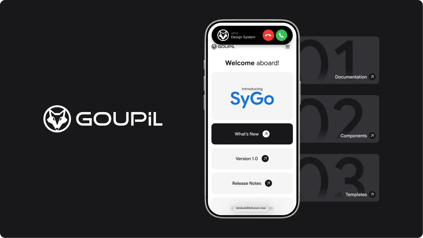
DESIGN SYSTEM
Creating SyGo was not just a matter of assembling components. It required defining a shared language that could support Goupil’s evolving digital ecosystem, from early research insights to future services. Clear principles, scalable foundations, and reusable patterns were essential to make every experience consistent, accessible, and easy to evolve without losing its connection to users’ real needs.
FOUNDATIONS
SyGo’s foundations define the essential rules behind every interface. Color, typography, iconography, spacing, opacity, borders, and radii work together to create a clear and recognisable visual language. By establishing these shared standards from the start, the system ensures consistency across products while giving teams the flexibility to build new experiences with confidence.
Foundations
Color Palette
System Colors
v01.1 2026
opacity
full (100%)
dark (80%)
half (50%)
light (40%)
none (0%)
shade of gray
#000000
#18181B
#333338
#5A5A5F
#8F8F92
#D0D0D1
#E5E5E5
#F4F4F5
#FFFFFF
black
gray800
gray700
gray500
gray400
gray300
gray200
gray100
white
AA
A6
A5
A4
A3
A2
A15
A1
A0
shade of blue
#002941
#005388
#0077C8
#00C7FF
#A7ECFF
#EDFBFF
blue900A
blue700A
blue500A
blue400A
blue300A
blue100A
B6
B5
B4
B3
B2
B1
State Colors
v01.1 2026
opacity
full (100%)
dark (80%)
half (50%)
light (40%)
none (0%)
informative
#064A97
#1672DB
#2F90FF
blue800
blue600
blue400
BI3
BI2
BI1
warning
#A28202
#DDB203
#FFCC00
yellow800
yellow600
yellow400
YW3
YW2
YW1
positive
#00381A
#09582E
#0E8345
green800
green600
green400
GP3
GP2
GP1
negative
#750000
#A00000
#CC0000
red800
red600
red400
RN3
RN2
RN1
Accent Colors
v01.1 2026
opacity
full (100%)
dark (80%)
half (50%)
light (40%)
none (0%)
Blue Accent
#064A97
#1672DB
#2F90FF
blue800
blue600
blue400
BI3
BI2
BI1
Dark Accent
#000000
#18181B
black
gray800
AA
A6
Light Accent
#F4F4F5
#FFFFFF
gray100
white
A1
A0
Foundations
Google Sans Font
Google Sans
Font
v01.1 2026
Bold
Bold 700
family: Google Sans
ID : Bold 700
Every interaction should feel simple, intuitive, and purposeful.
0123456789
Bold 700 Italic
family: Google Sans
ID : Bold 700 Italic
Every interaction should feel simple, intuitive, and purposeful.
0123456789
SemiBold
SemiBold 600
family: Google Sans
ID : SemiBold 600
Every interaction should feel simple, intuitive, and purposeful.
0123456789
SemiBold 600 Italic
family: Google Sans
ID : SemiBold 600 Italic
Every interaction should feel simple, intuitive, and purposeful.
0123456789
Medium
Medium 500
family: Google Sans
ID : Medium 500
Every interaction should feel simple, intuitive, and purposeful.
0123456789
Medium 500 Italic
family: Google Sans
ID : Medium 500 Italic
Every interaction should feel simple, intuitive, and purposeful.
0123456789
Regular
Regular 400
family: Google Sans
ID : Regular 400
Every interaction should feel simple, intuitive, and purposeful.
0123456789
Regular 400 Italic
family: Google Sans
ID : Regular 400 Italic
Every interaction should feel simple, intuitive, and purposeful.
0123456789
Foundations
Material Design Icons by Google Fonts


Foundations
Google Fonts
Border
none (0)
xxs (0.5)
xs (1)
s (2)
m (4)
l (6)
xl (8)
xxl (16)
Opacity
full (100%)
dark (80%)
half (50%)
light (40%)
none (0%)
Radius
none (0)
xs (4)
s (8)
m (16)
l (24)
xl (48)
full (999)
Spacer
256px (16rem)
192px (12rem)
128px (8rem)
96px (6rem)
64px (4rem)
48px (3rem)
32px (2rem)
24px (1.5rem)
16px (1rem)
8px (0.5rem)
LAYOUT GRIDS
Layout grids provide the structure behind SyGo’s interfaces. They define how content is aligned, spaced, and organised across different screen sizes, creating clear hierarchies and predictable user journeys. By using a shared grid system, each product can remain visually consistent while adapting naturally to the needs of desktop, tablet, and mobile experiences.
Small
(320-639px)
range: from 320px (20rem)
columns: 4
margins: 16px
gutter: 16px
Medium
(640-1023px)
range: from 640px (40rem)
columns: 8
margins: 24px
gutter: 24px
Large
(1024-1440px)
range: from 1024px (64rem)
columns: 12
margins: 64px
gutter: 24px
Extra Large
(1441px and up)
range: from 1440px (90rem)
columns: 12
margins: 108px
gutter: 24px
Small no margin
(320-639px)
range: from 320px (20rem)
columns: 4
margins: 0px
gutter: 16px
Medium no margin
(640-1023px)
range: from 640px (40rem)
columns: 8
margins: 0px
gutter: 24px
Large no margin
(1024-1440px)
range: from 1024px (64rem)
columns: 12
margins: 0px
gutter: 24px
Extra Large no margin
(1441px and up)
range: from 1440px (90rem)
columns: 12
margins: 0px
gutter: 24px
COMPONENTS
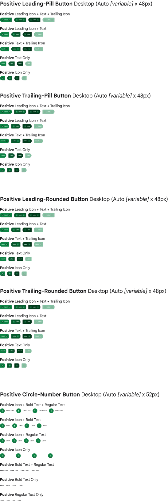
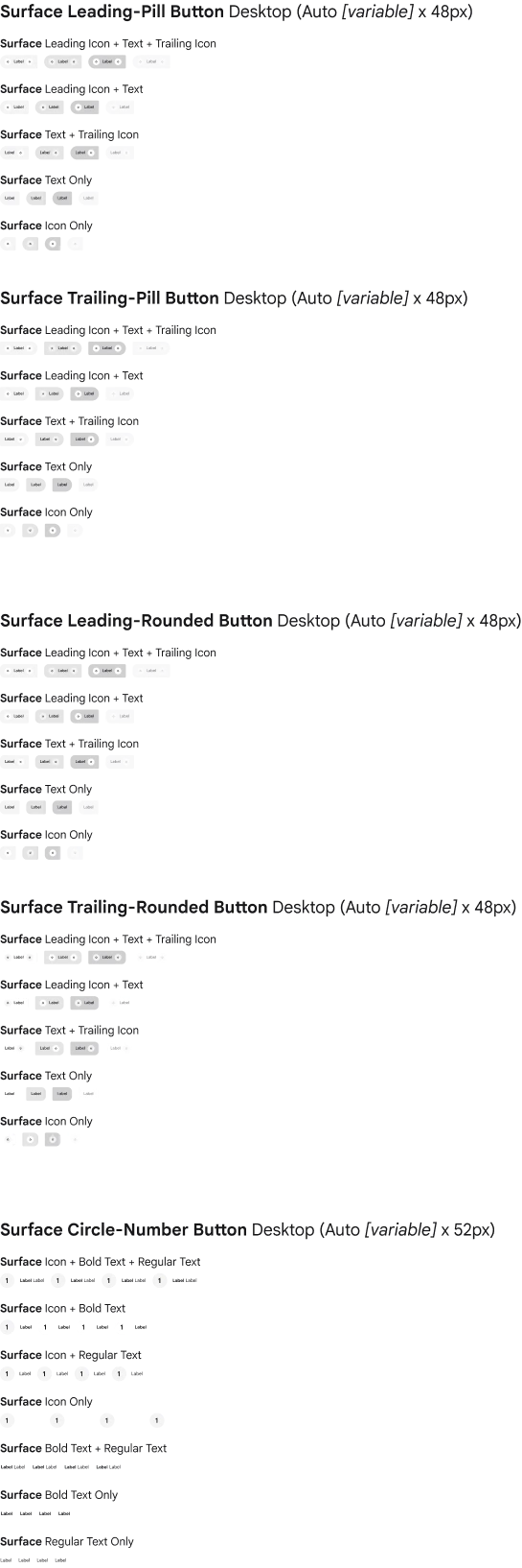
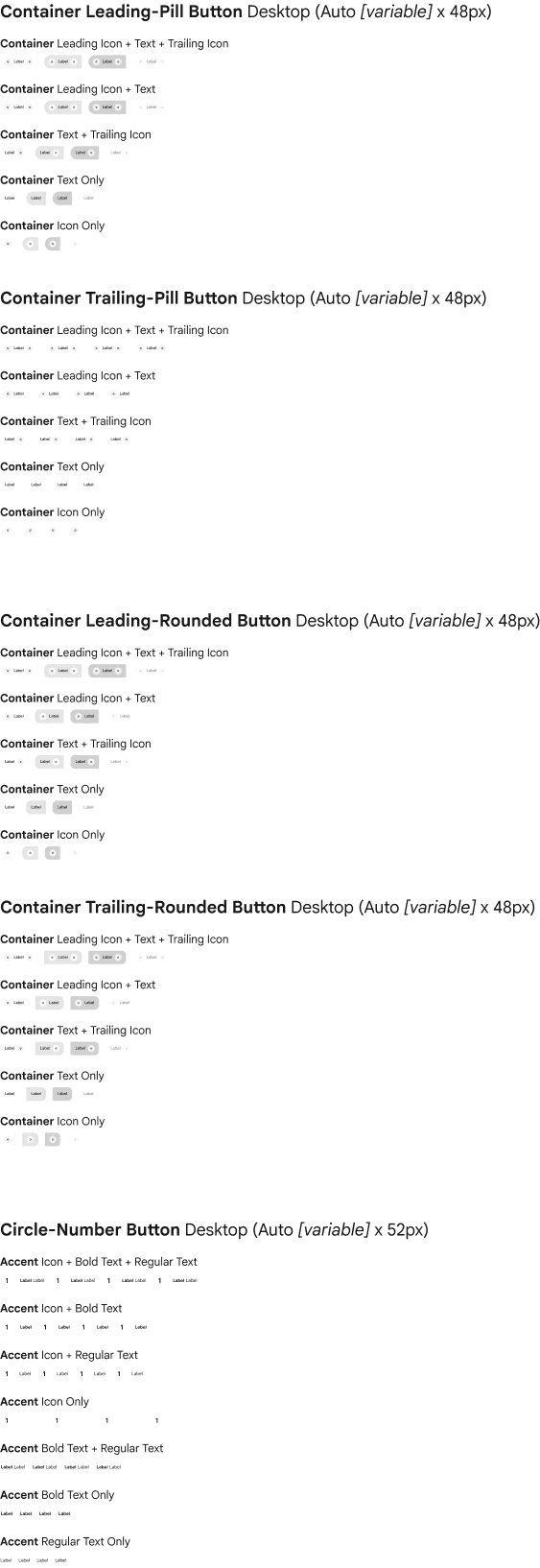
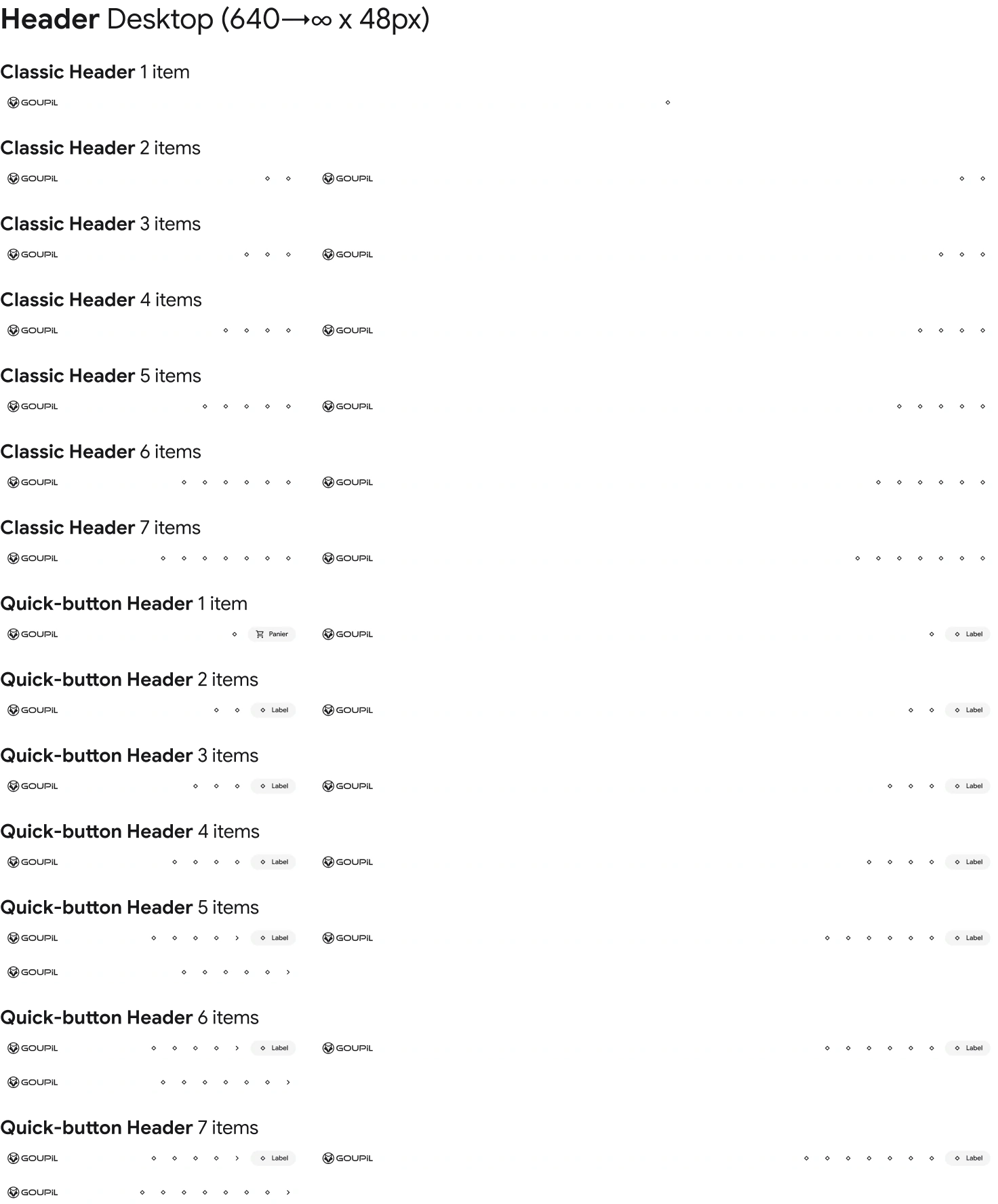
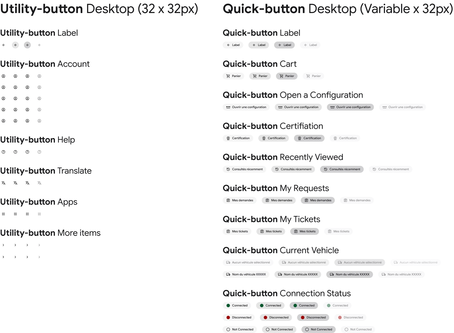
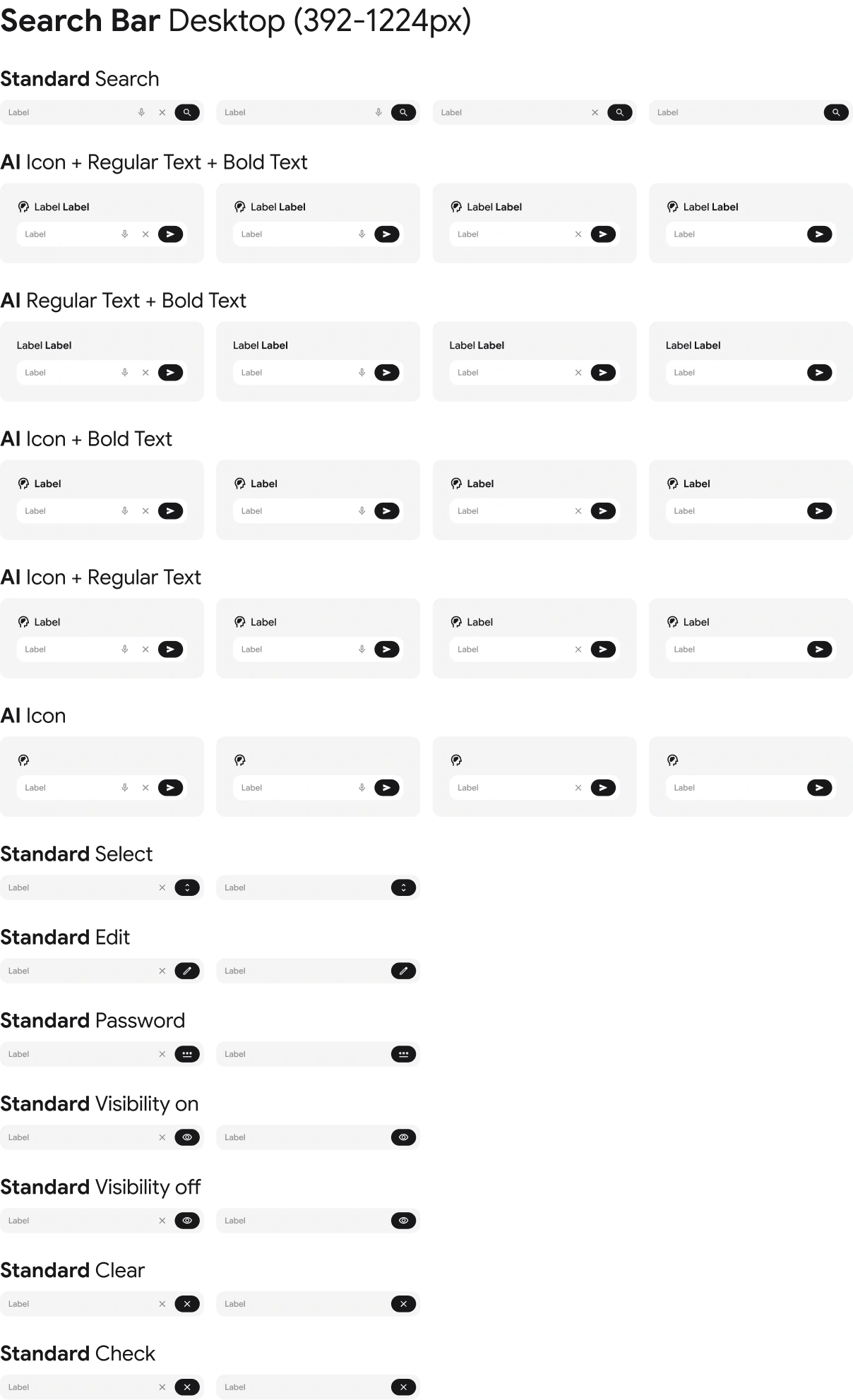
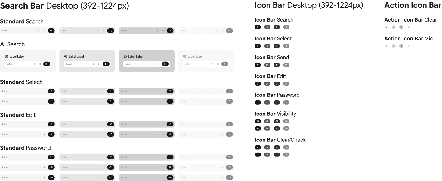
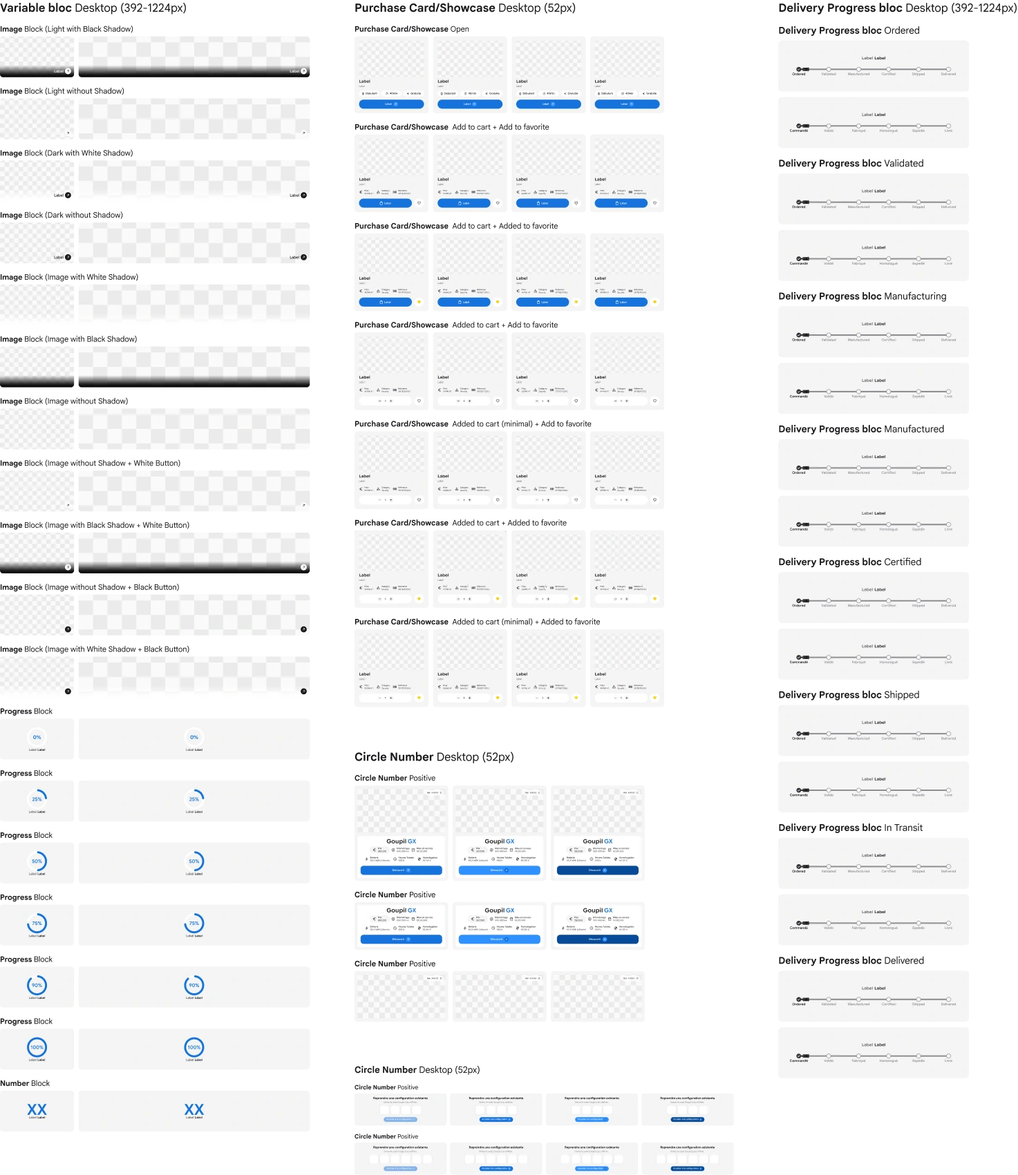
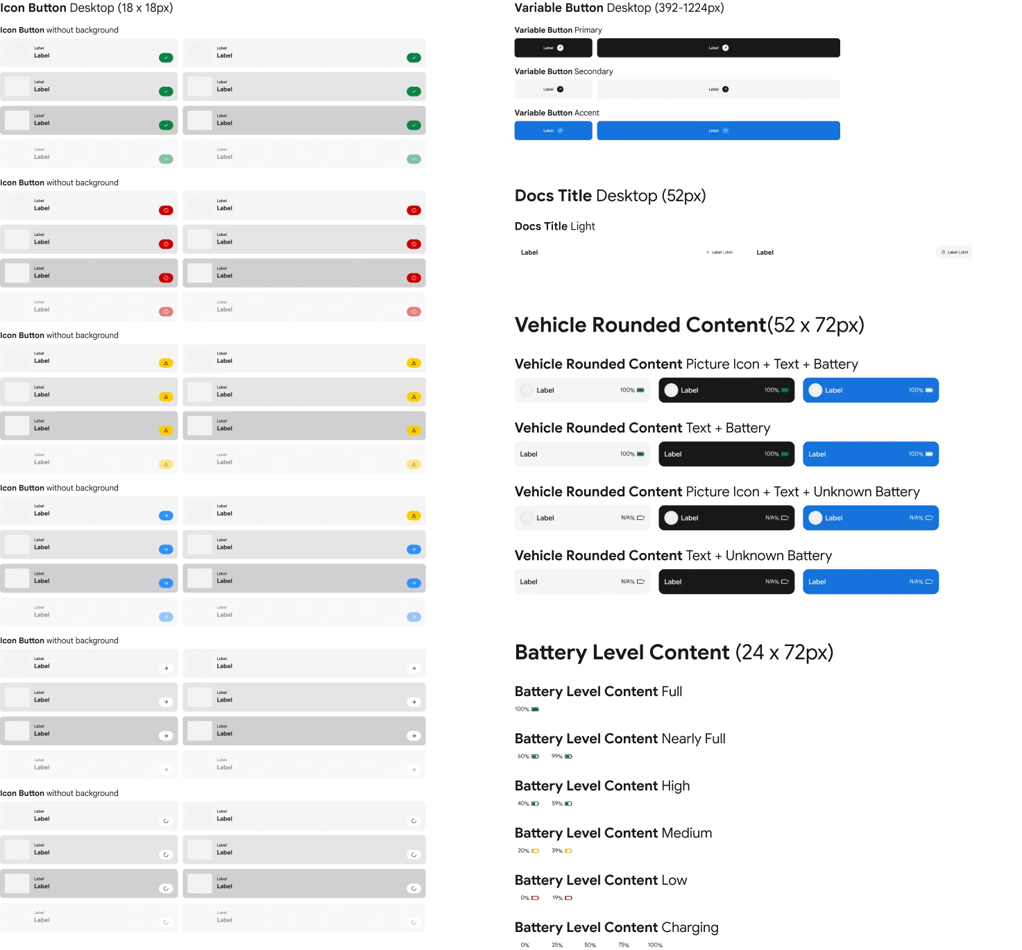
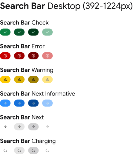
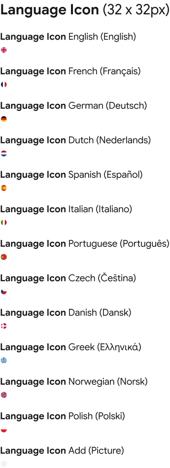
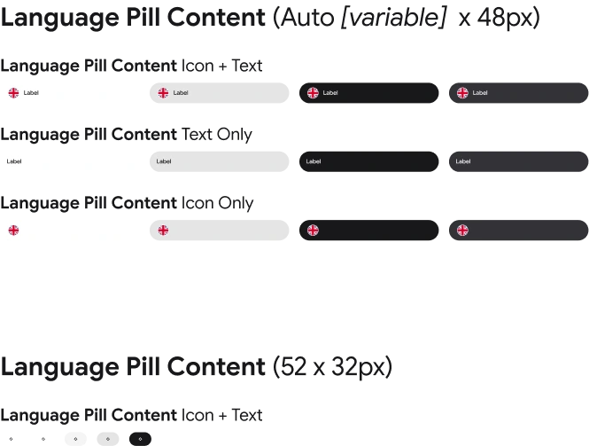
Components are the reusable building blocks of SyGo. From buttons and form fields to navigation and selection controls, each element is designed to solve a recurring user need with consistency and clarity. Documented states, behaviours, and responsive rules make interfaces faster to build, easier to maintain, and more reliable for every user.
Components
Icons
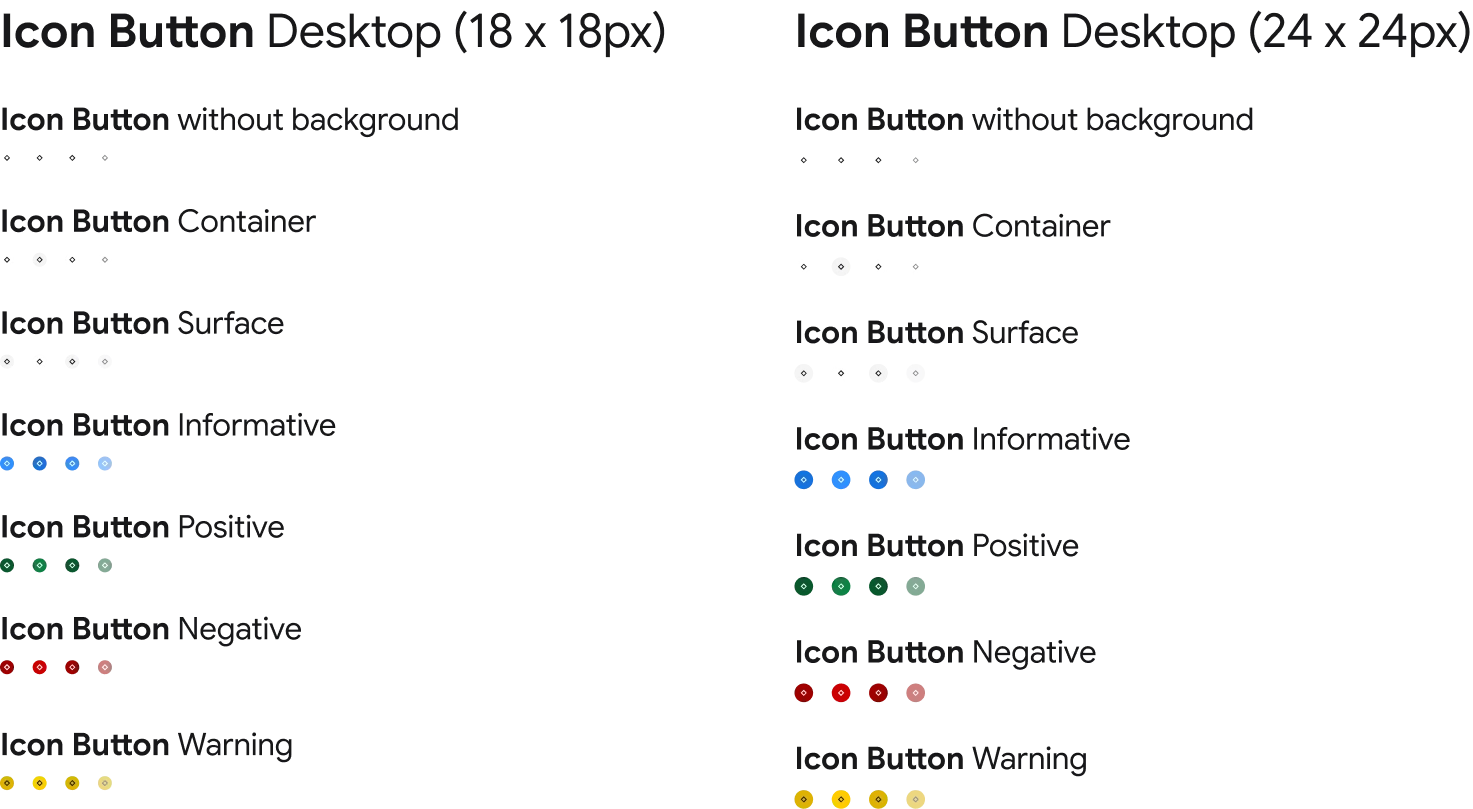
Components
Buttons
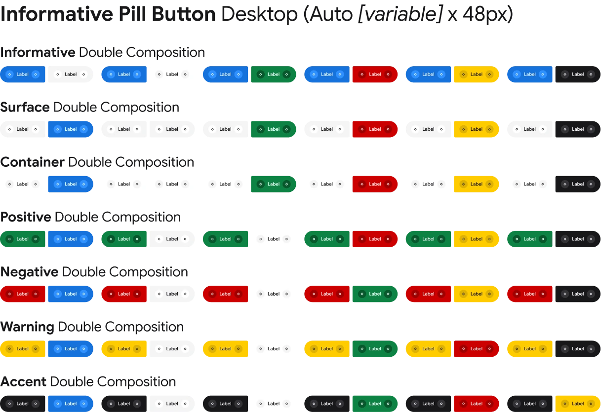
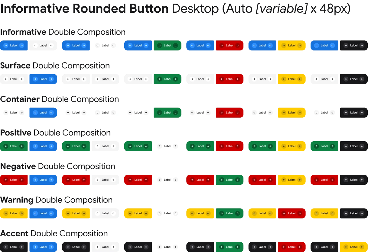
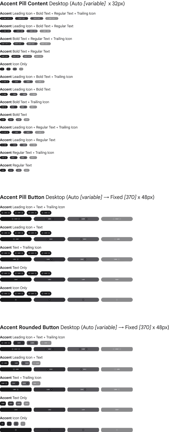
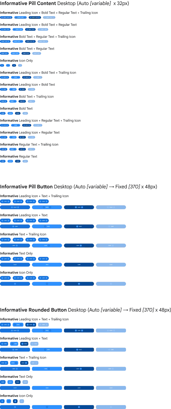
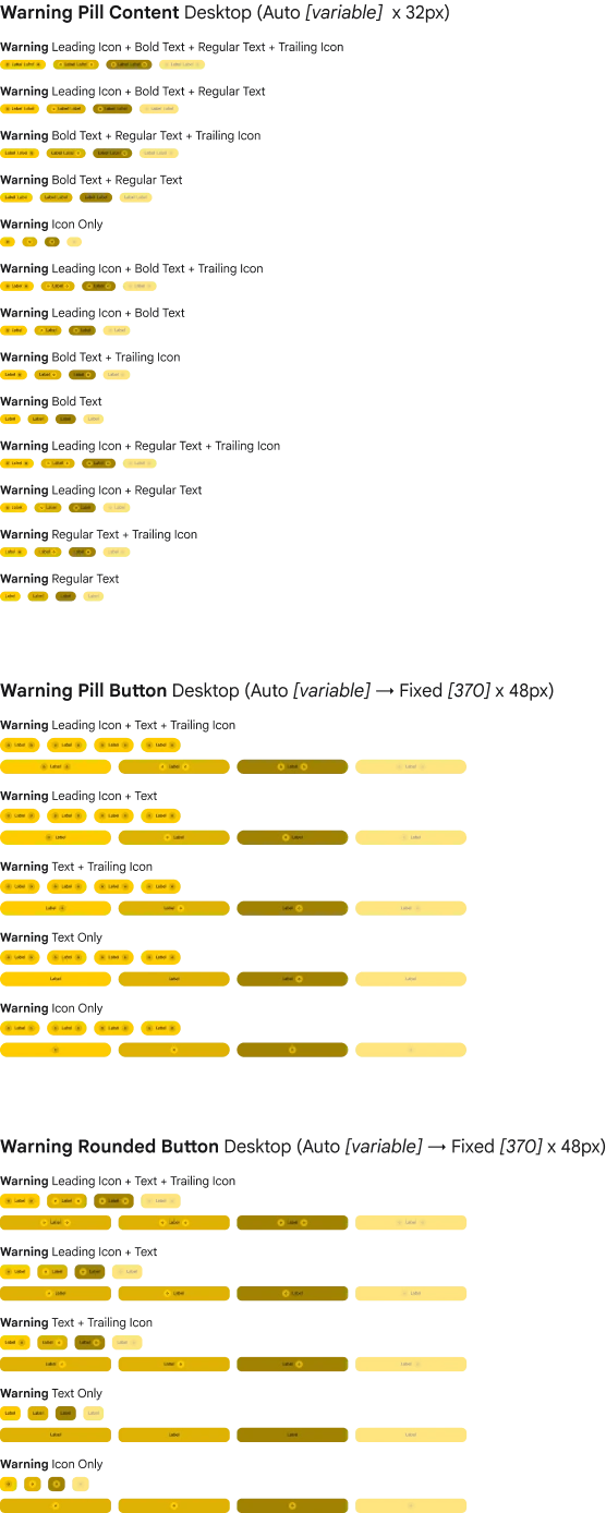
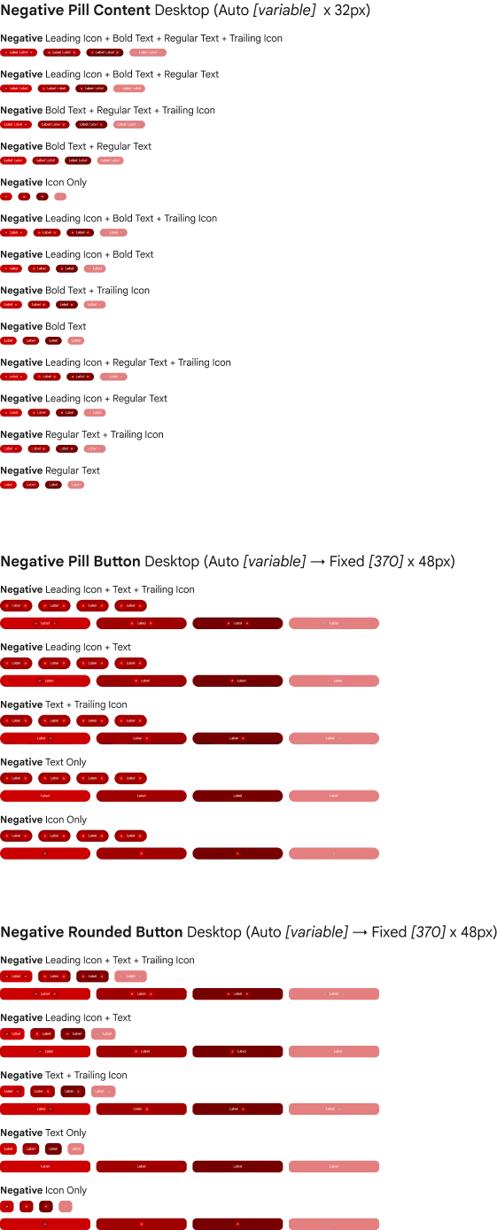
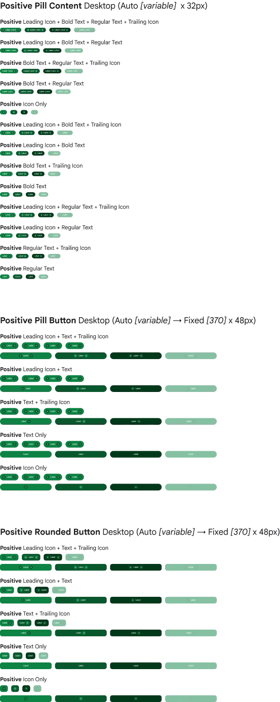
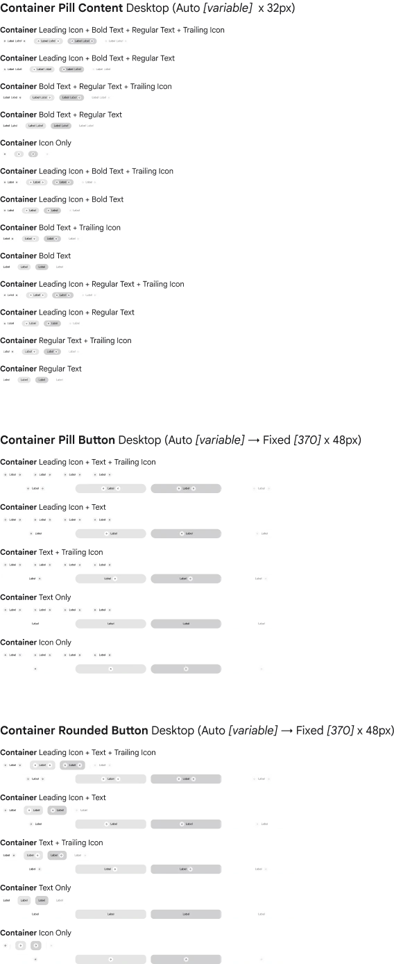
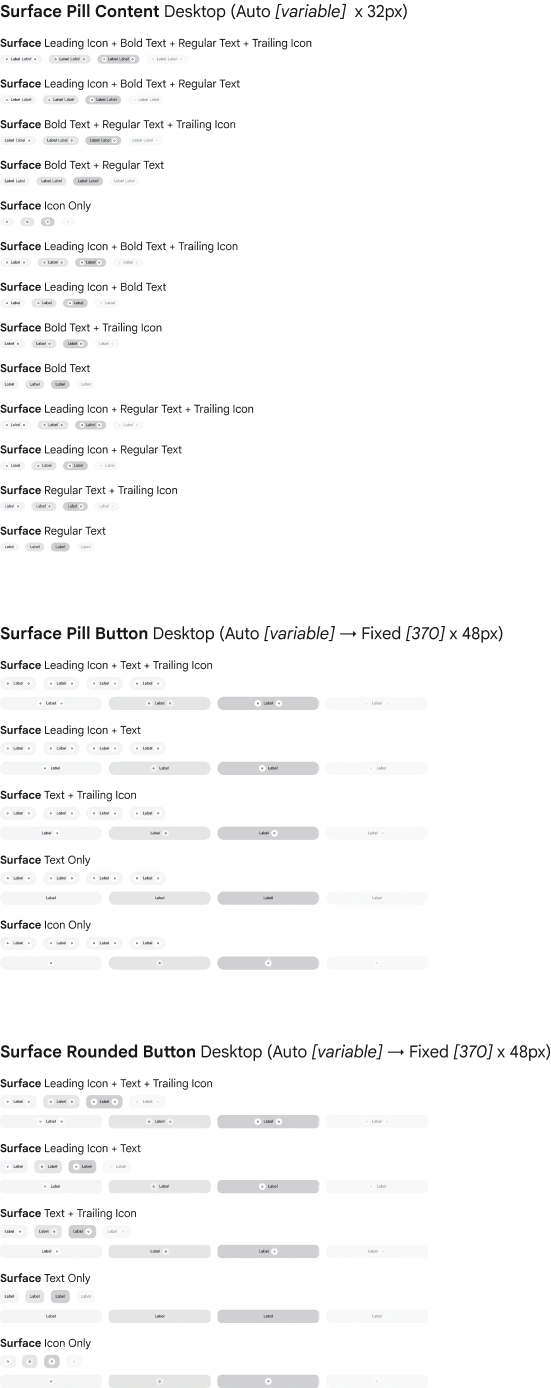
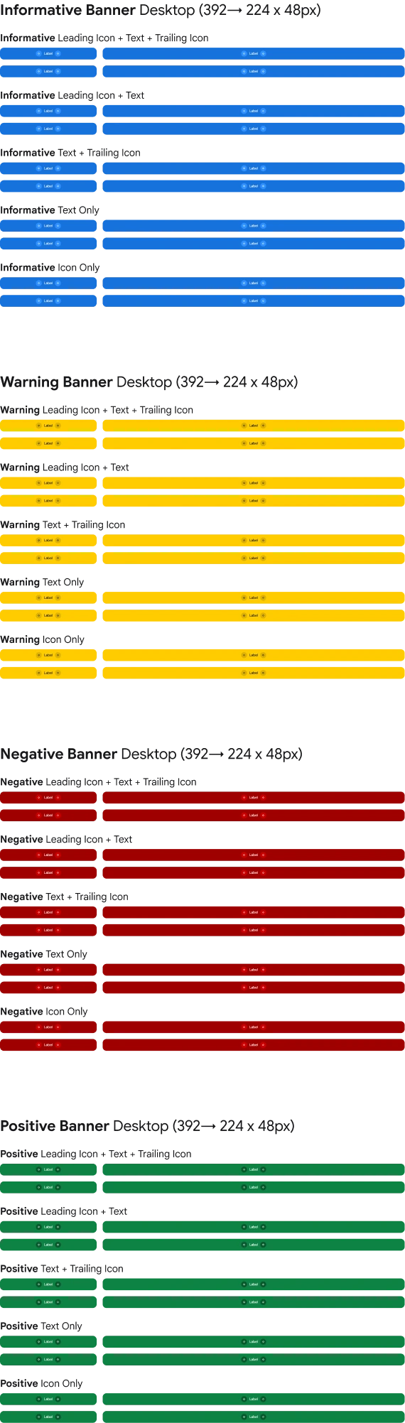
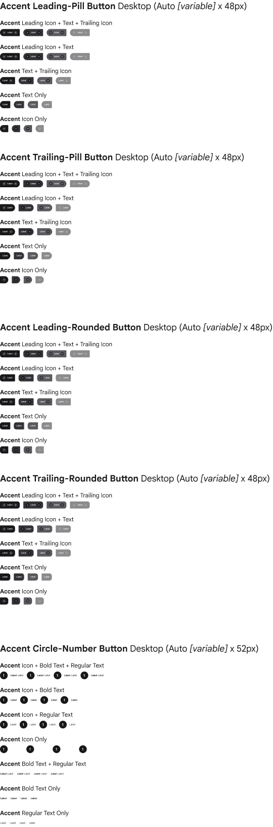
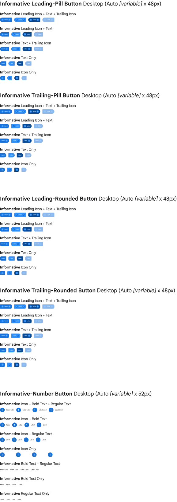
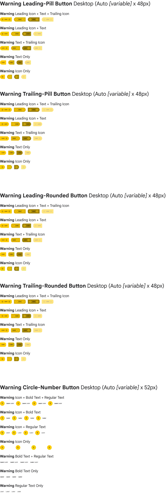
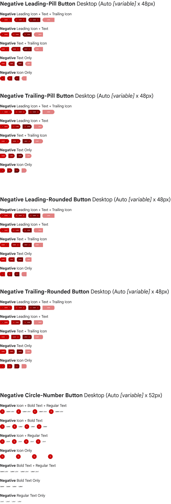
Components
Header
Components
Search
Components
Content & Progress
Components
Action Buttons
Components
Language Contents
Components
Segmented Navigation
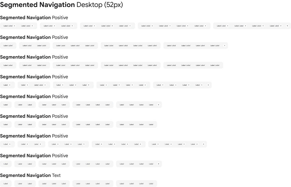
Components
Circle Number & Text Button
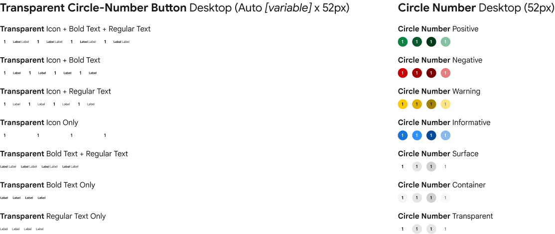
Components
Table of Contents
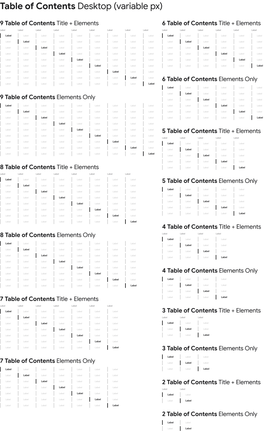
Usability Criteria
 0/5 critical
 1/5 insufficient
 2/5 fair
 3/5 acceptable
 4/5 good
 5/5 excellent
Clarity. The product presents information in a simple, understandable, and unambiguous way.
Example: clear labels, strong visual hierarchy, minimal visual clutter.
User Control. The product allows users to easily reverse or modify their actions.
Example: canceling an action, editing a request, or returning to a previous step.
Flexibility. The product adapts to different user profiles, use cases, and levels of expertise.
Example: simplified access for customers, advanced features for technicians.
Error Prevention. The product anticipates potential errors and supports users before they occur.
Example: required field validation, data verification, warning messages before sensitive actions.
Consistency. The product maintains the same patterns, behaviors, and interaction logic across all interfaces.
Example: consistent components, terminology, and actions across services.
Visibility. The product continuously informs users about its status, progress, and ongoing actions.
Example: service ticket status, order progress, loading indicators.
Guidance. The product helps users complete tasks with minimal effort.
Example: pre-filled forms, automatic suggestions, guided workflows.
Help & Support. The product provides the resources users need when assistance is required.
Example: documentation, tutorials, FAQs, or technical support.
Example
1/5 clarity
2/5 user control
3/5 flexibility
0/5 error prevention
4/5 consistency
0/5 visibility
1/5 guidance
1/5 help & support
ECOSYSTEM
Built on SyGo’s foundations, Goupil’s digital ecosystem brings together a suite of connected platforms designed around the real needs of drivers, fleet managers, technicians, dealers, and customers. From configuring a vehicle to managing maintenance and accessing technical support, each platform solves a specific moment in the user journey while contributing to a more coherent, scalable, and future-ready service experience.

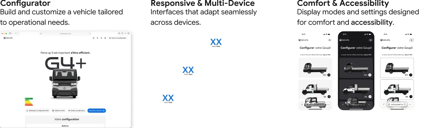
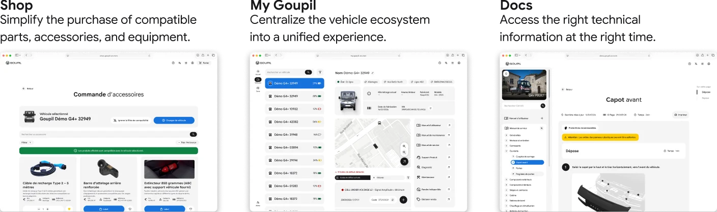
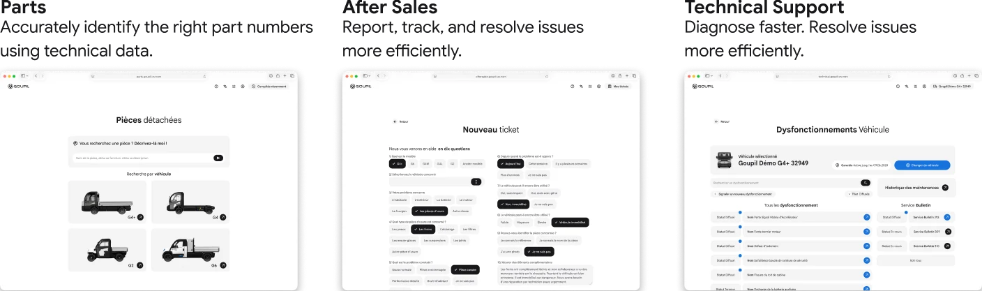
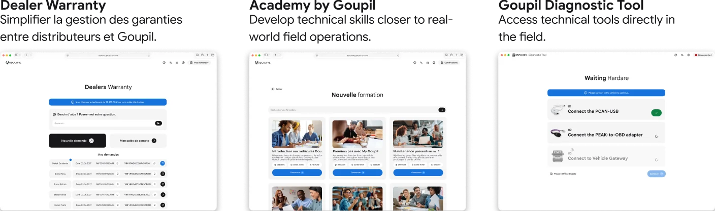
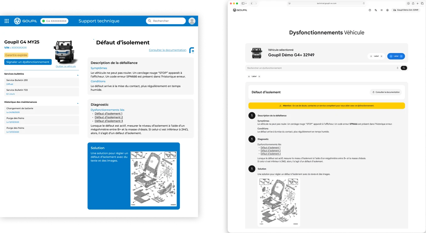
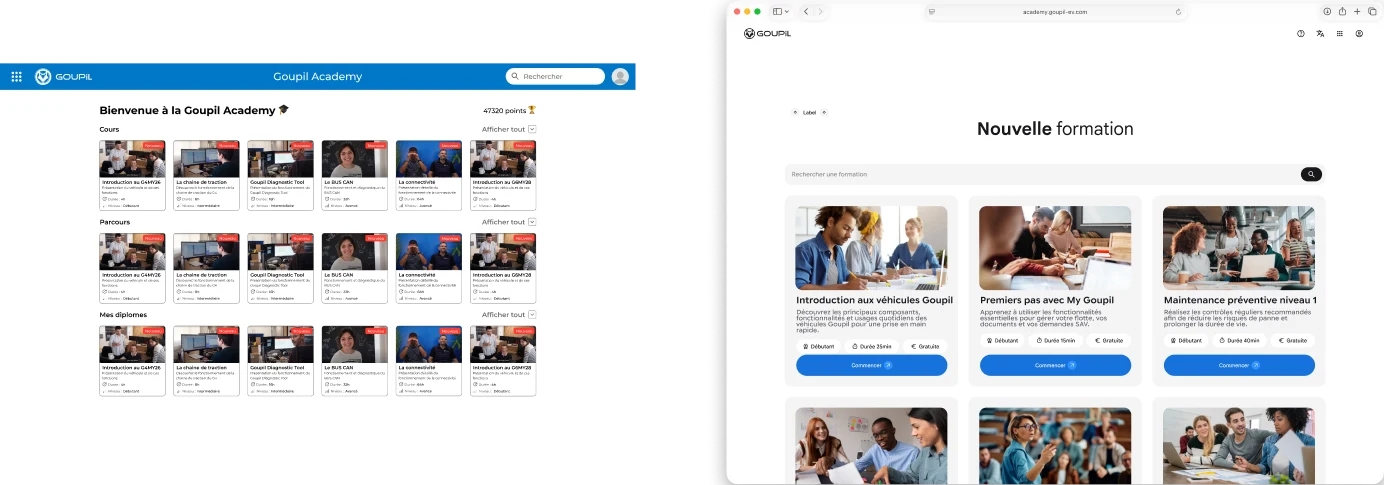
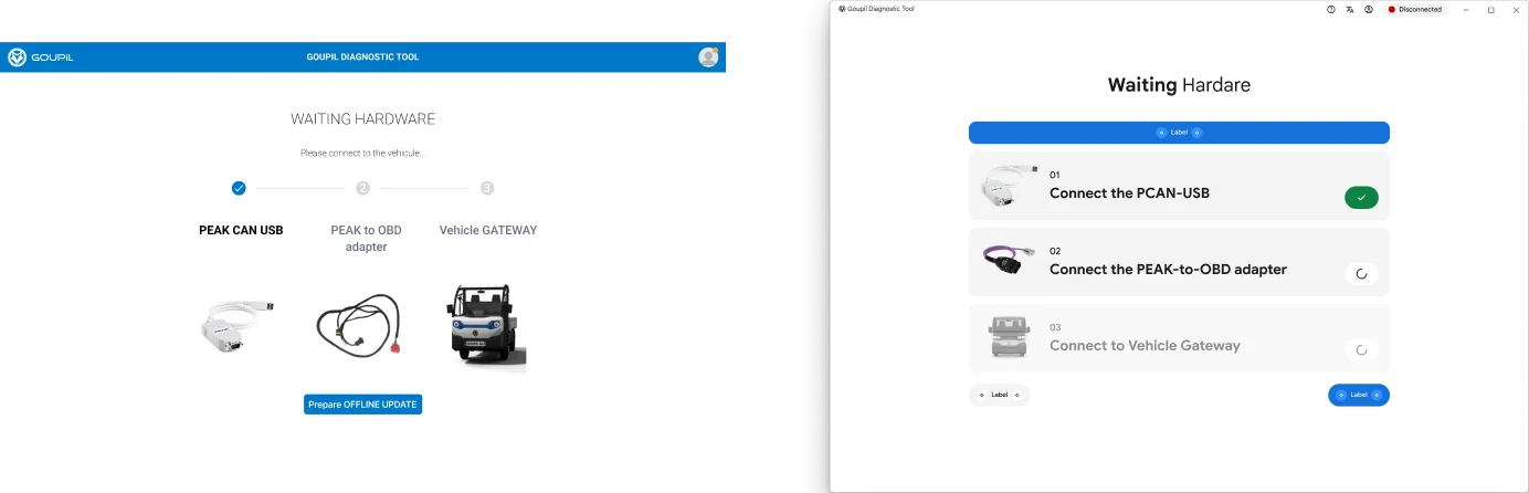
SELECTED EXPERIENCES
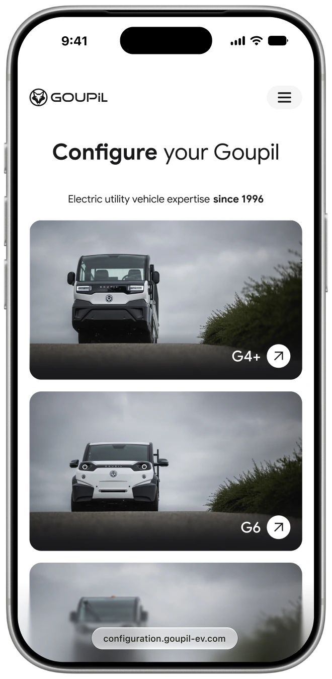
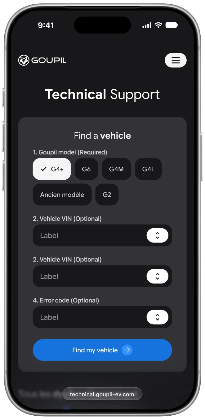
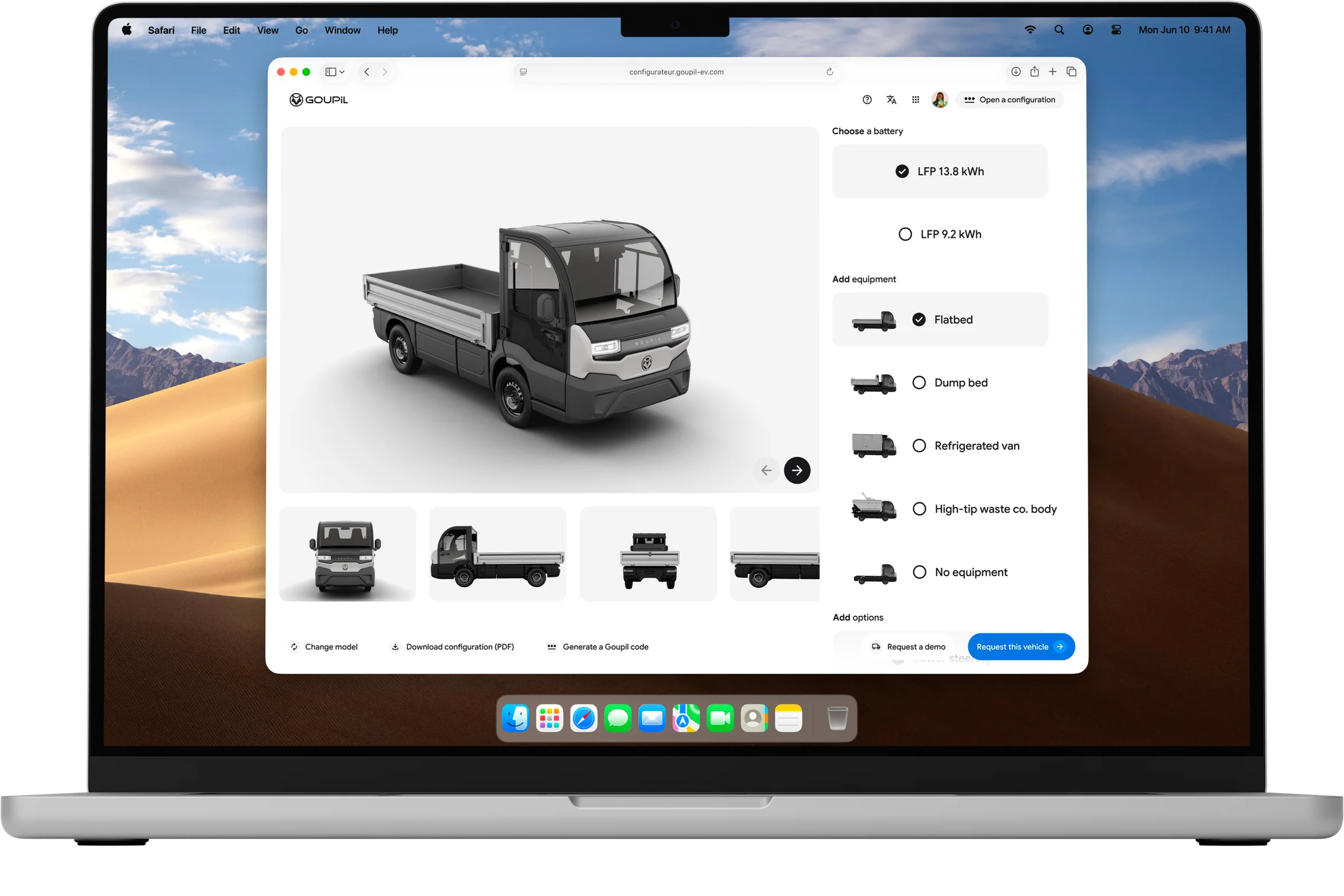
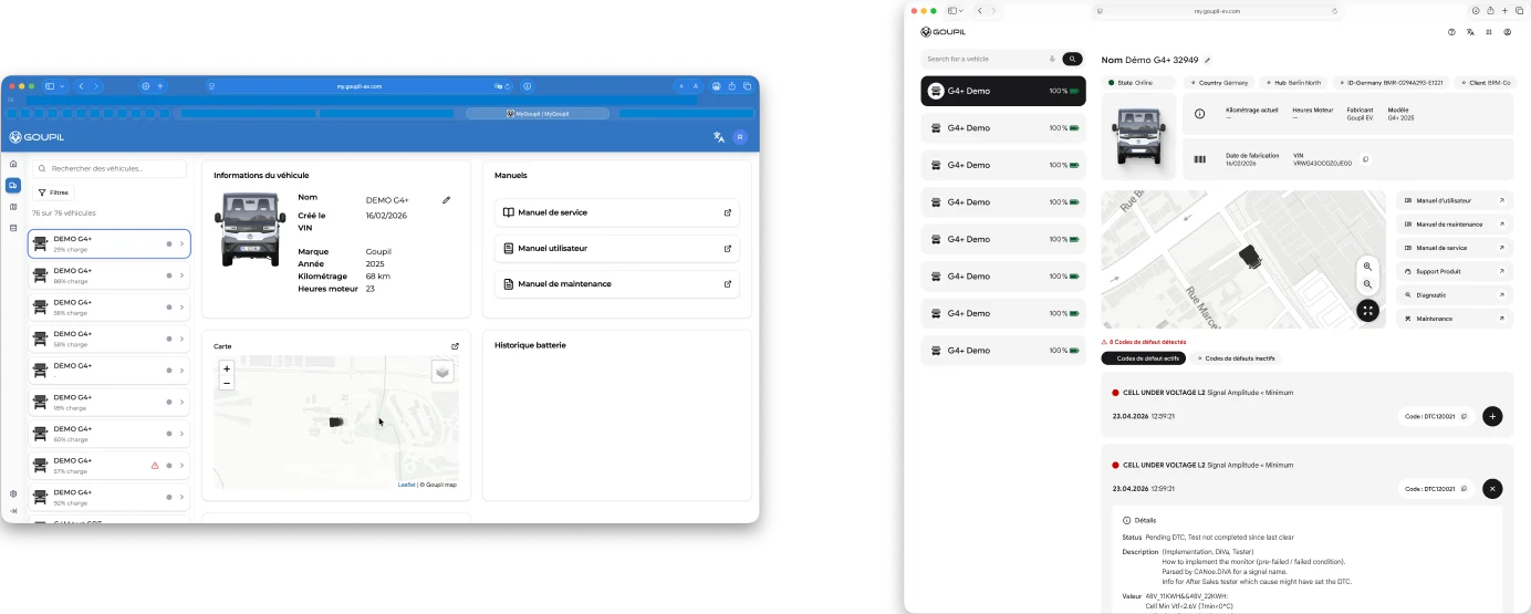
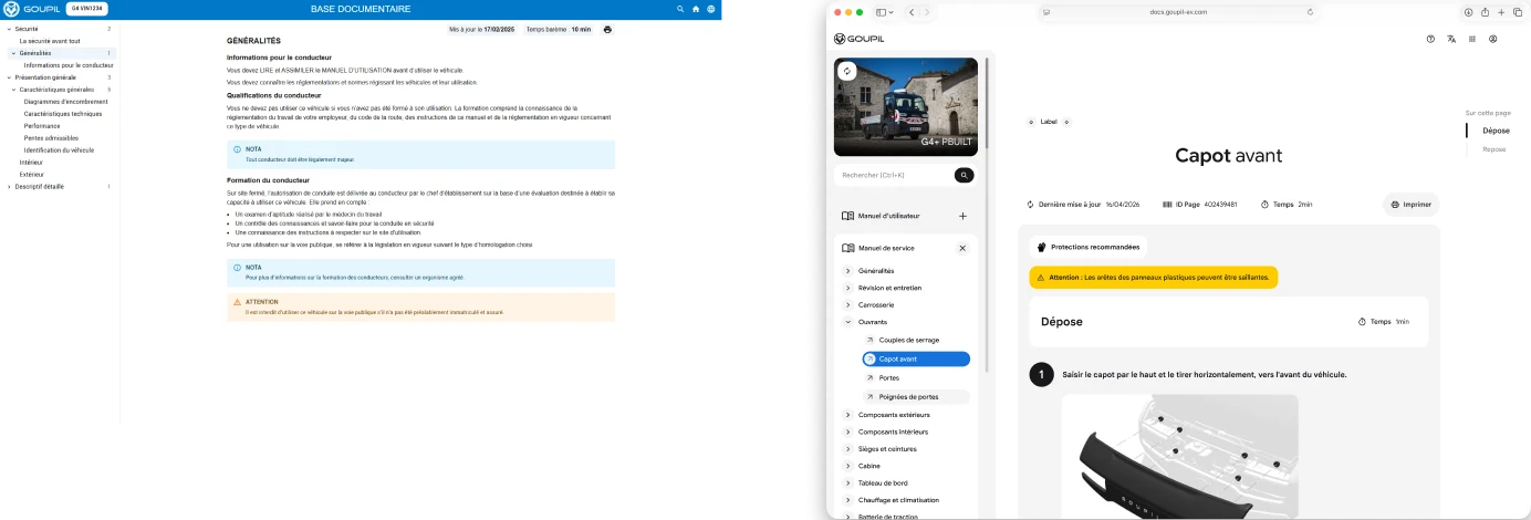
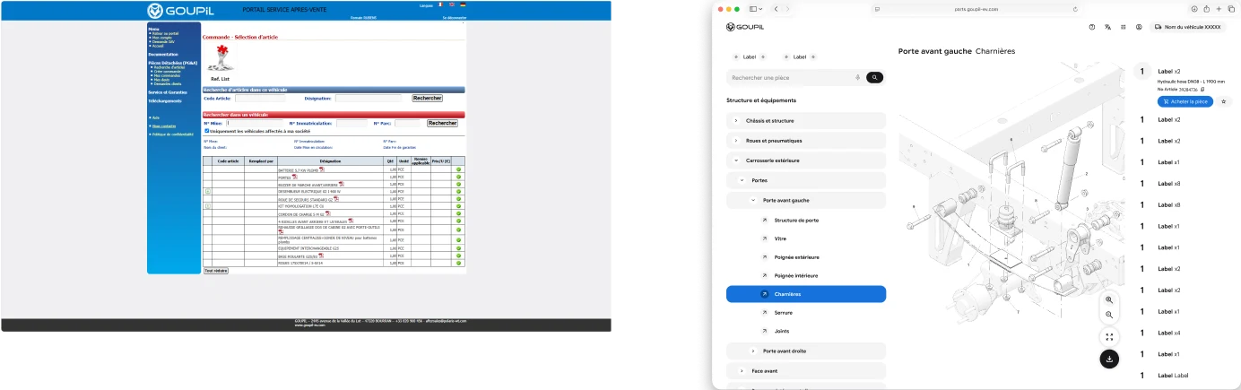
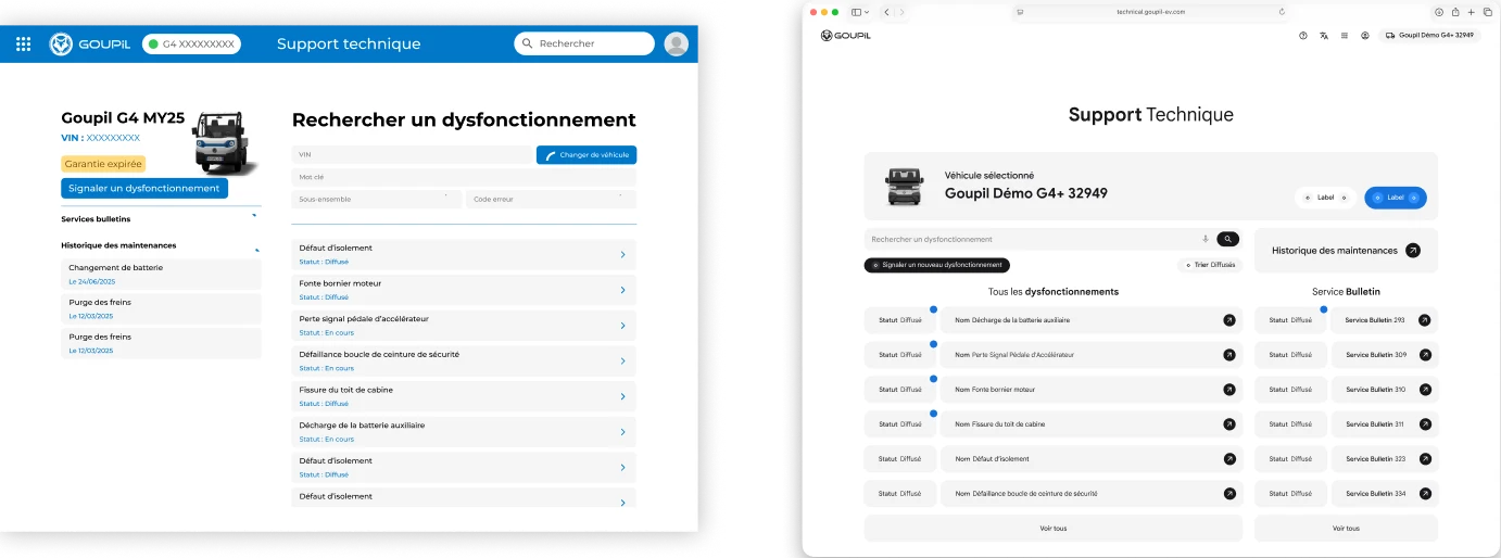
The following screens show how the ecosystem takes shape across selected platforms. Each experience translates a specific user need into a clear, practical interface, whether it involves configuring a vehicle, finding a part, tracking a service request, or accessing technical information. SyGo creates the consistency that connects these distinct journeys into one recognisable Goupil experience.
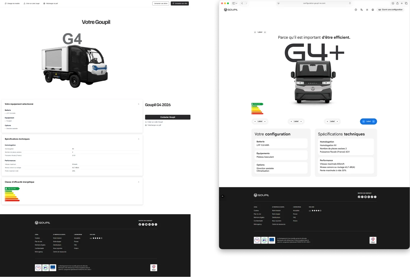
MODES
The system is designed to remain clear, familiar, and accessible in both light and dark modes. Beyond adapting colors, each mode preserves visual hierarchy, readability, contrast, and component behaviour, allowing the Goupil experience to feel consistent in every environment.