DESIGN QUESTION
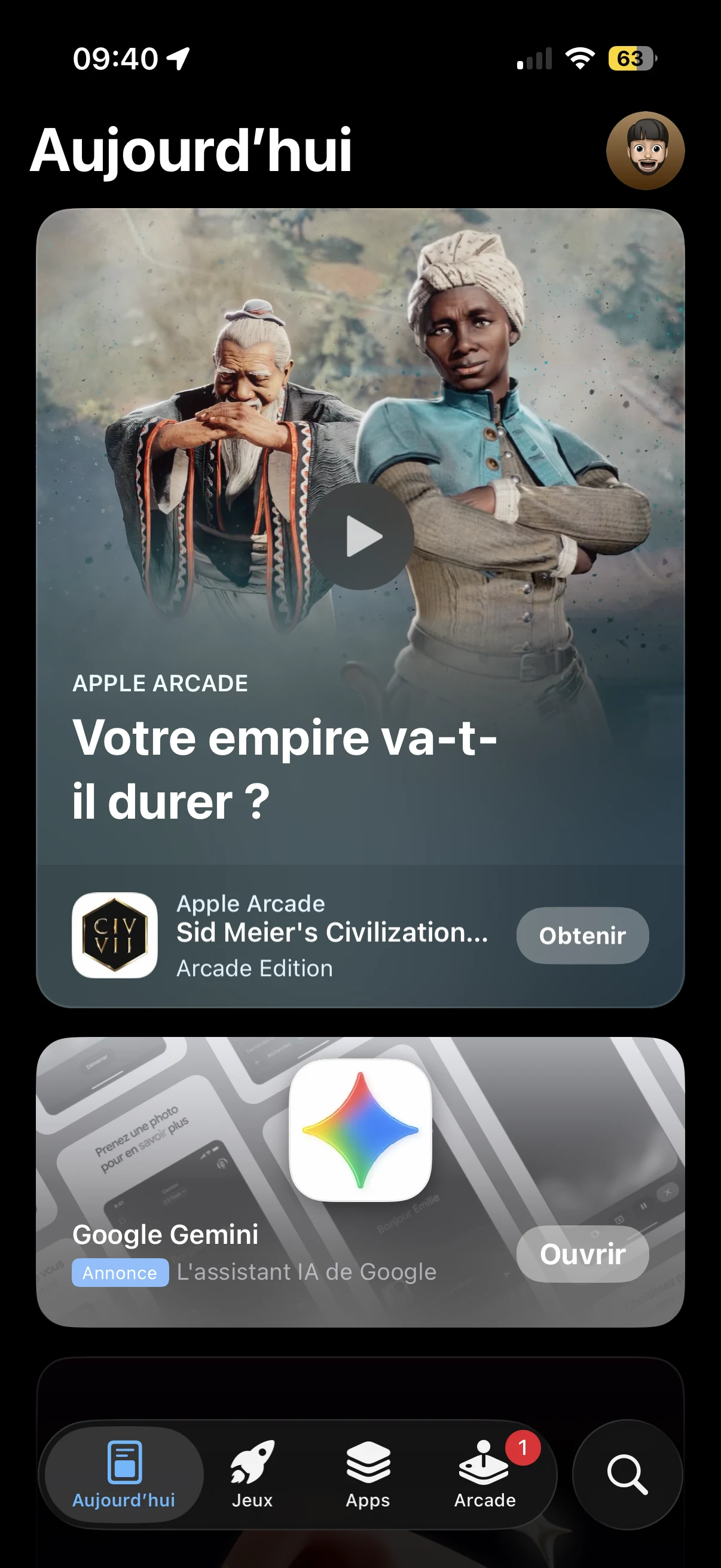
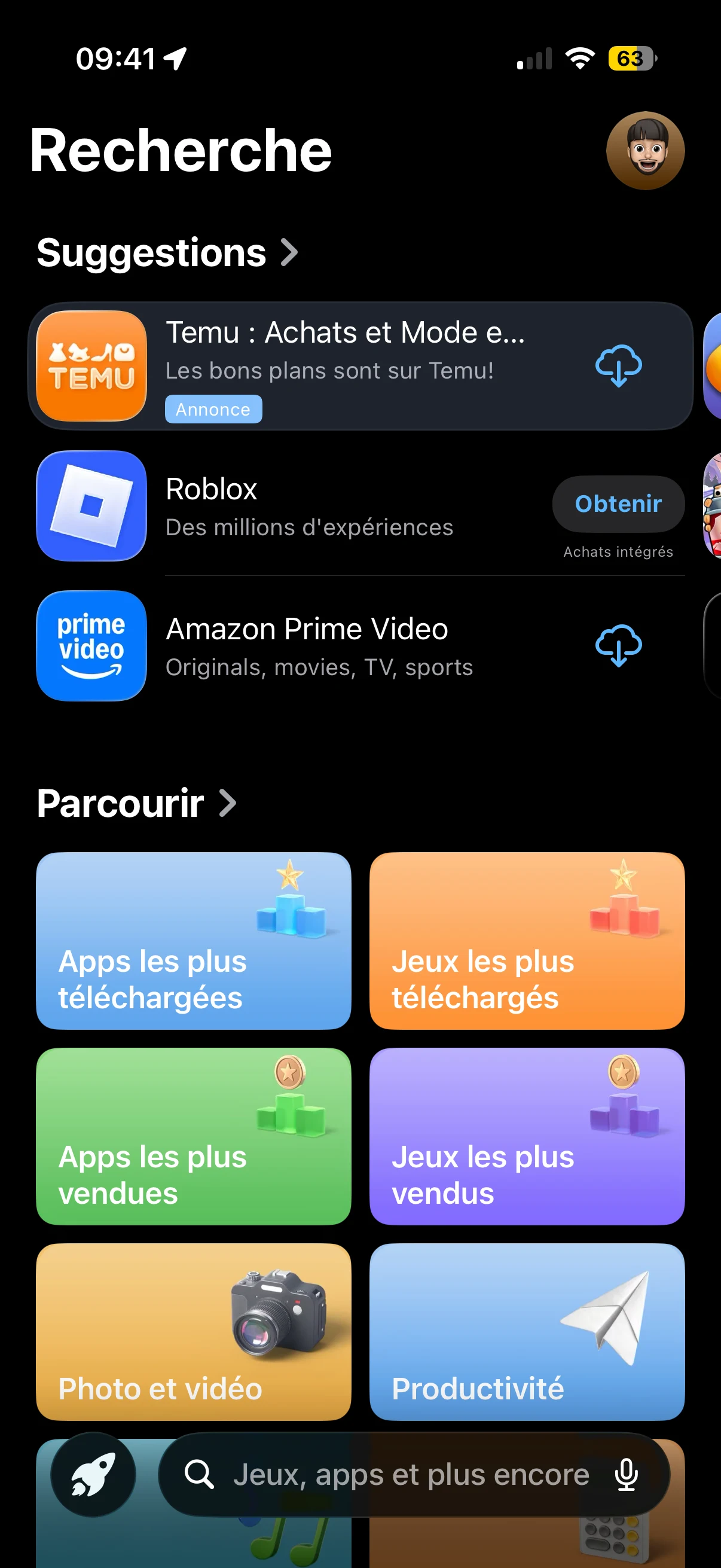
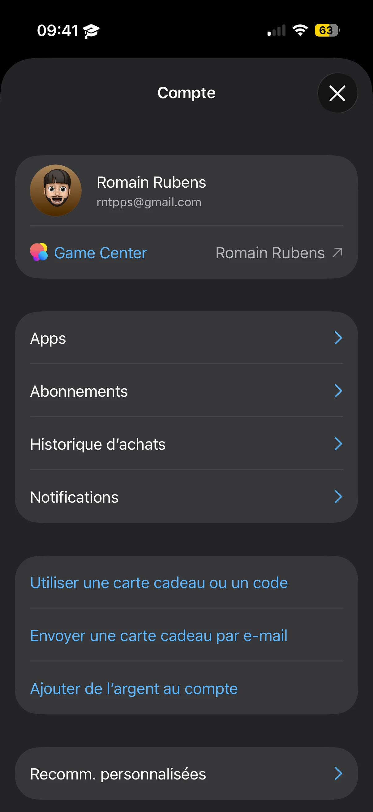
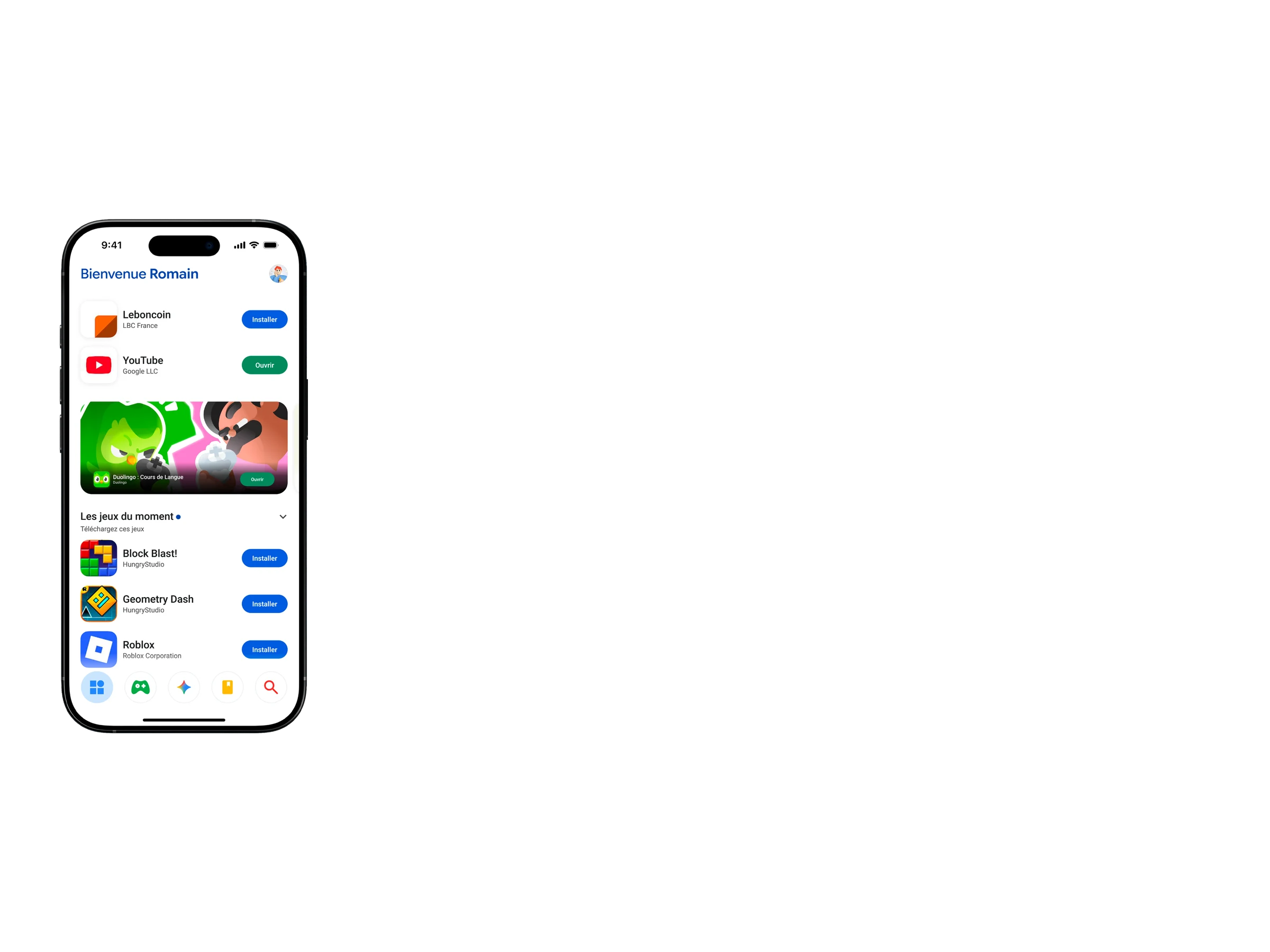
Integrating Google Play into the iOS ecosystem is not a simple porting exercise. Apple’s interfaces are defined by strict conventions: clear hierarchies, restrained visual language, and subtle micro-interactions that create a strong sense of coherence across the system. If an application deviates too far from these conventions, it immediately feels foreign within the platform.
Apple's obligation?
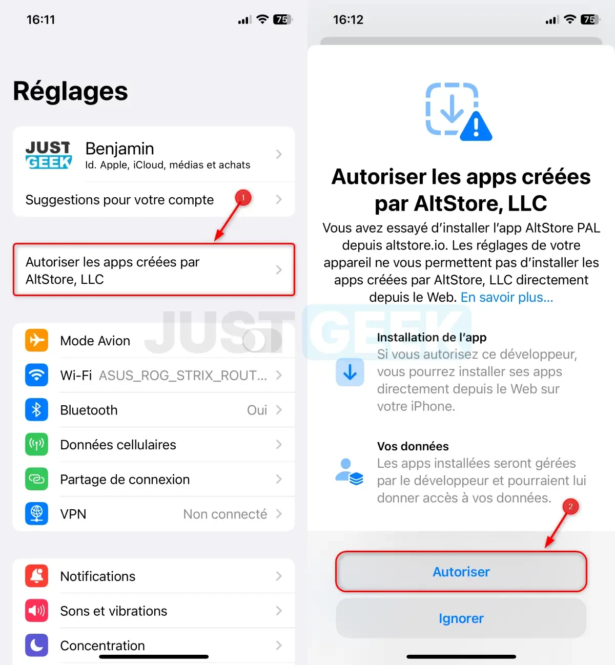
With the Digital Markets Act (DMA) taking effect in 2024, the European Union requires Apple to allow competing app stores on iOS within the EU. The goal is to curb its dominant position by mandating openness to third-party stores and alternative payments, in order to strengthen competition and user choice.
The 4 Colors
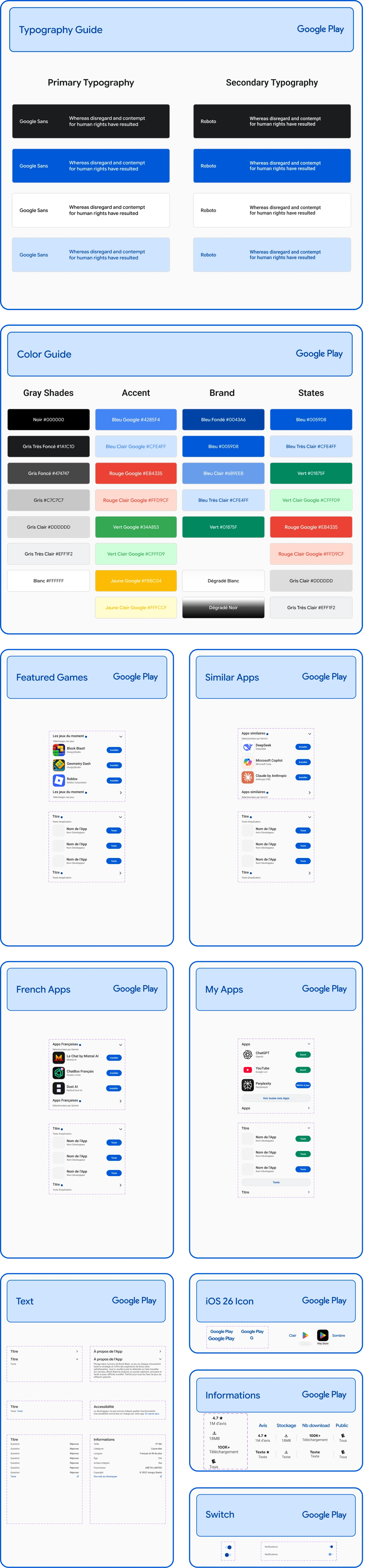
When colors alone are enough to recognize a brand, a value, and a vision, you have to take what's already done best and push it even further. No need to spell out what these four iconic colors stand for.

Drawing the logo
Without writing it out, it's made possible through the Google Flex Sans Font — letting what Google does best come through naturally: life.
Competition?
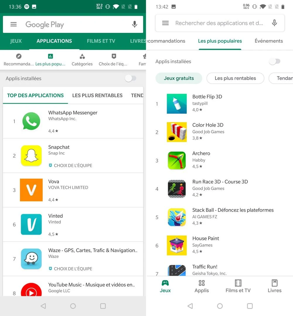
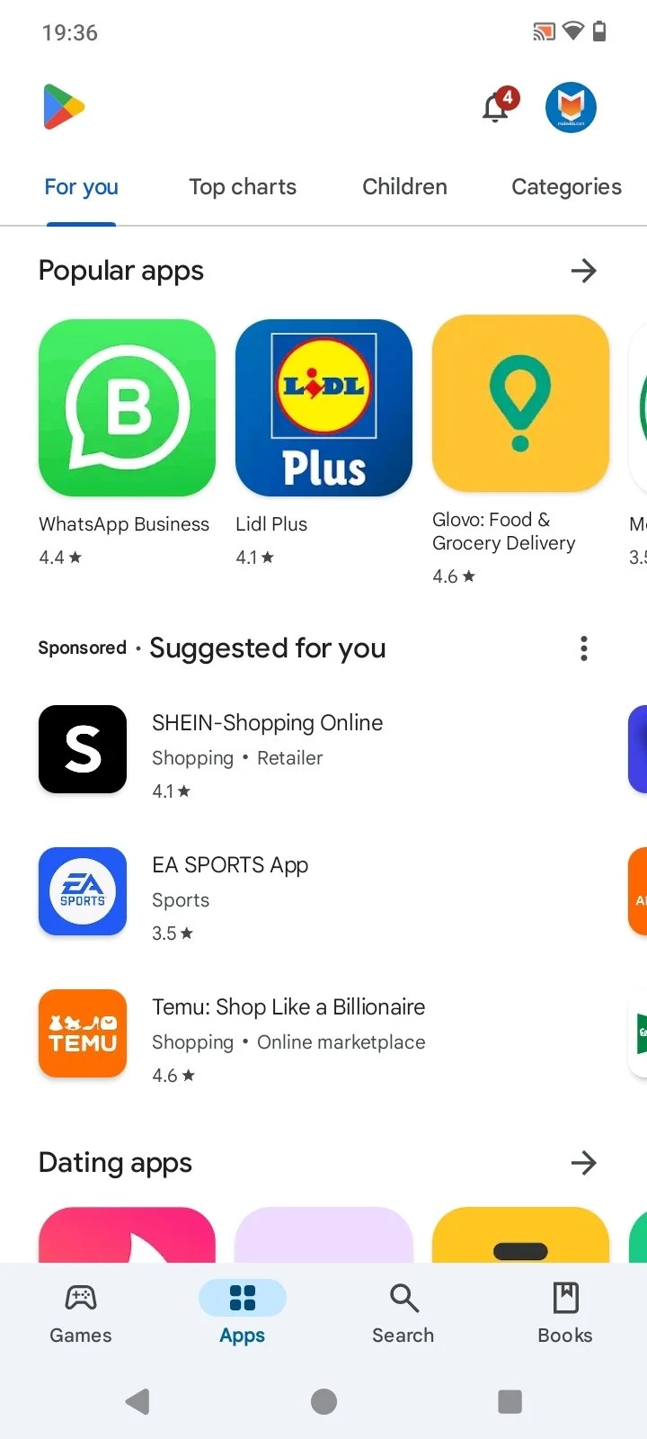
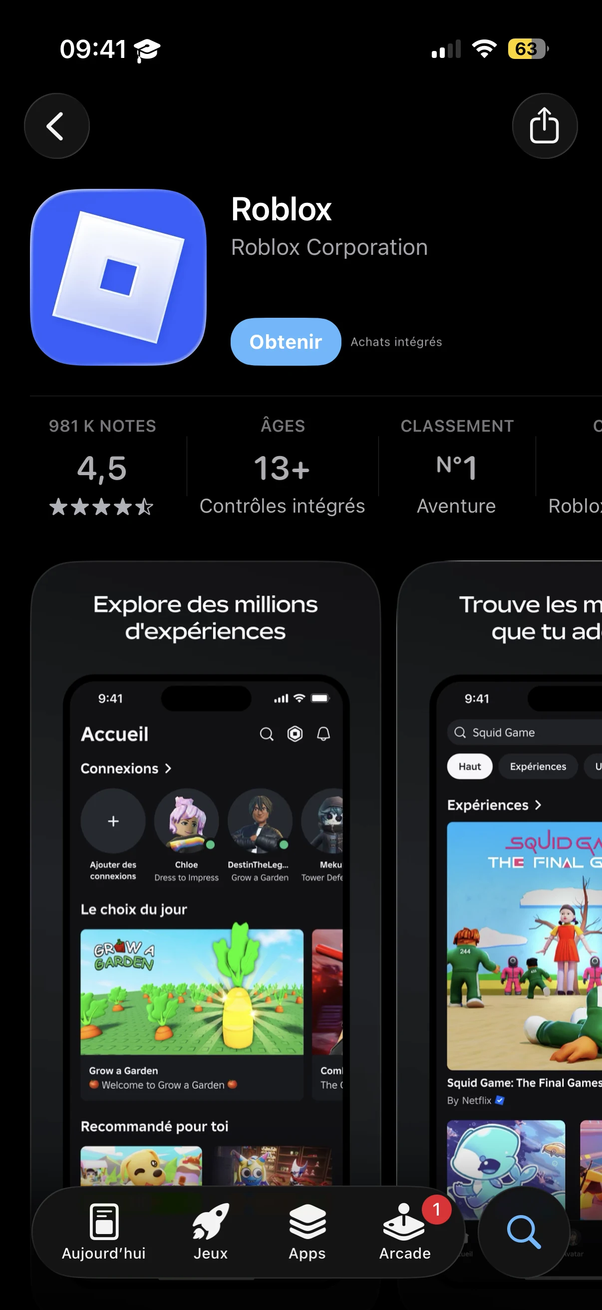
The App Store is the default app marketplace for Apple device users. It's widely known for being fairly limited compared to its Android counterpart. Bringing Google Play to iOS opens the door to real competition and a broader mindset.
Google Play
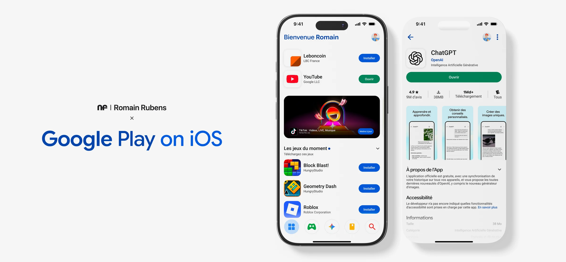
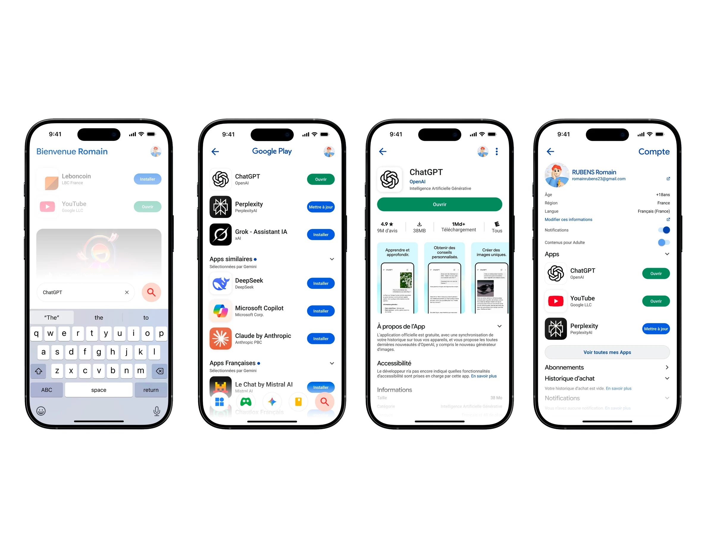
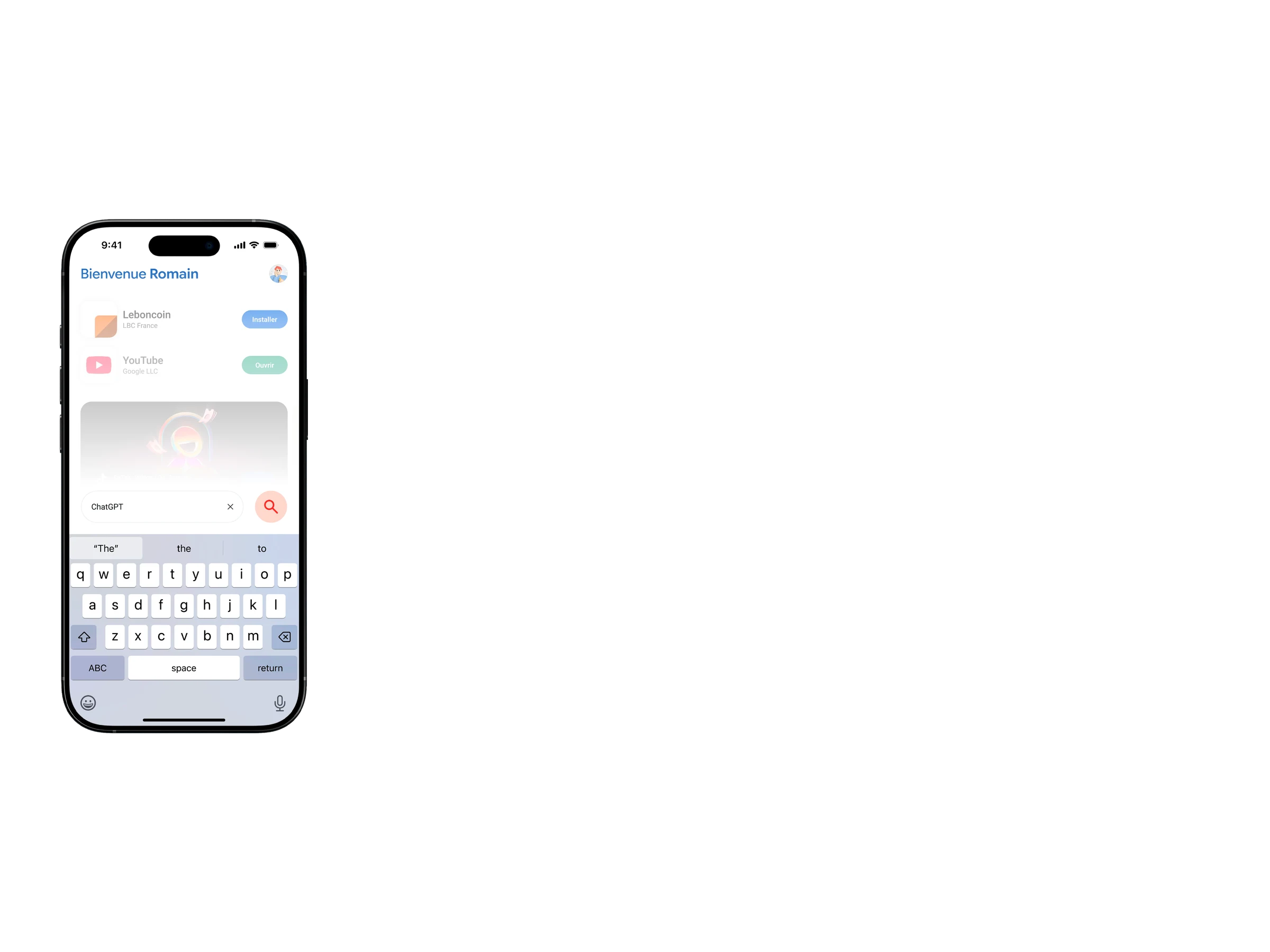
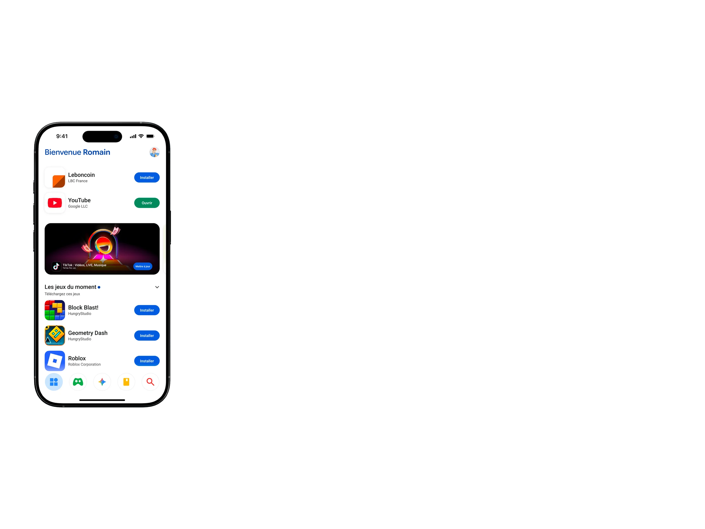
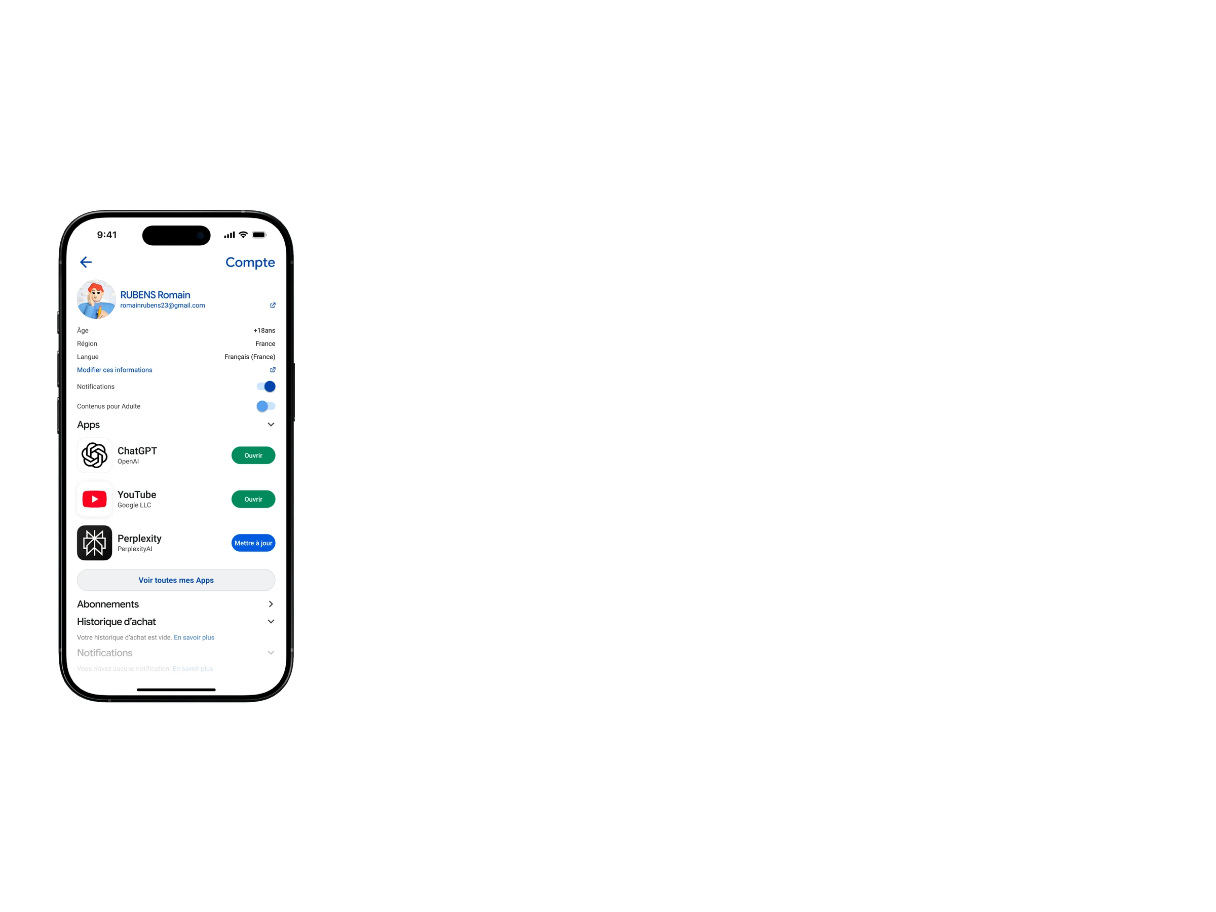
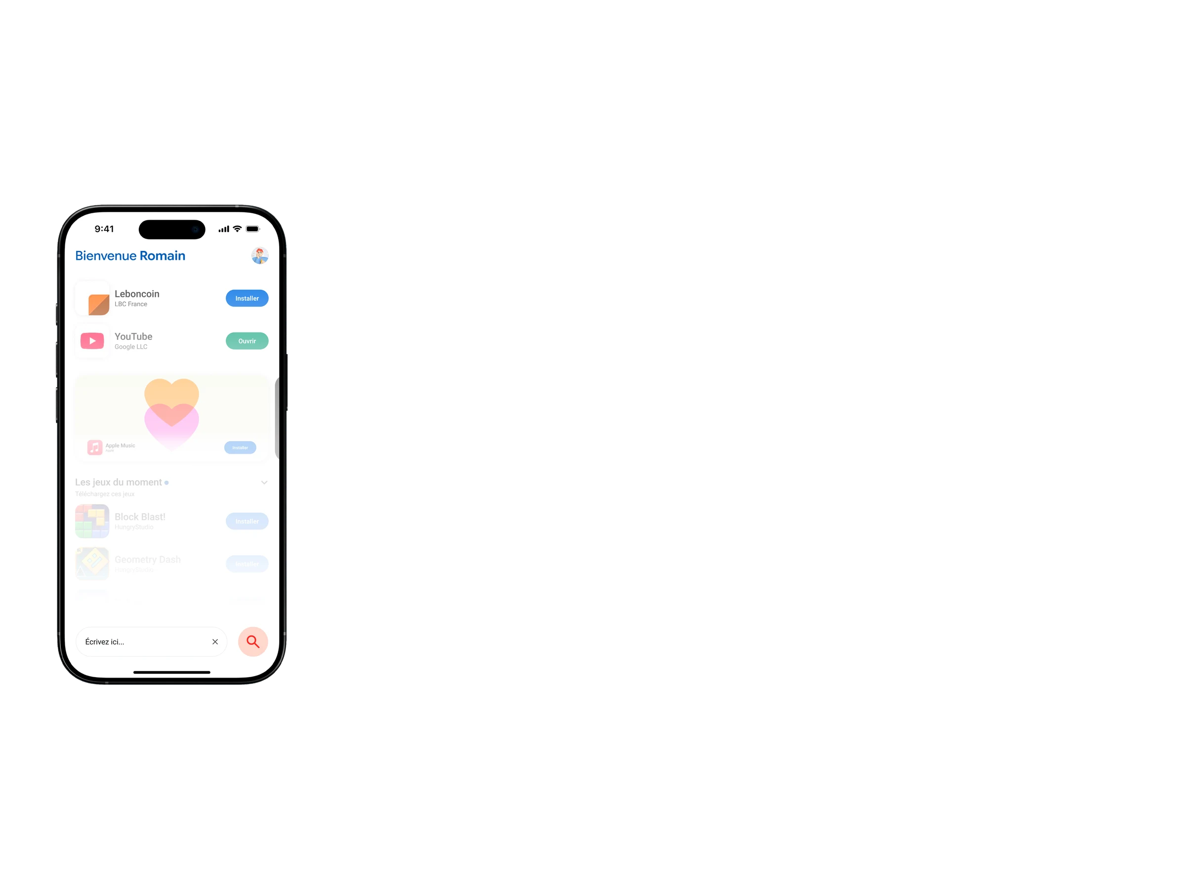
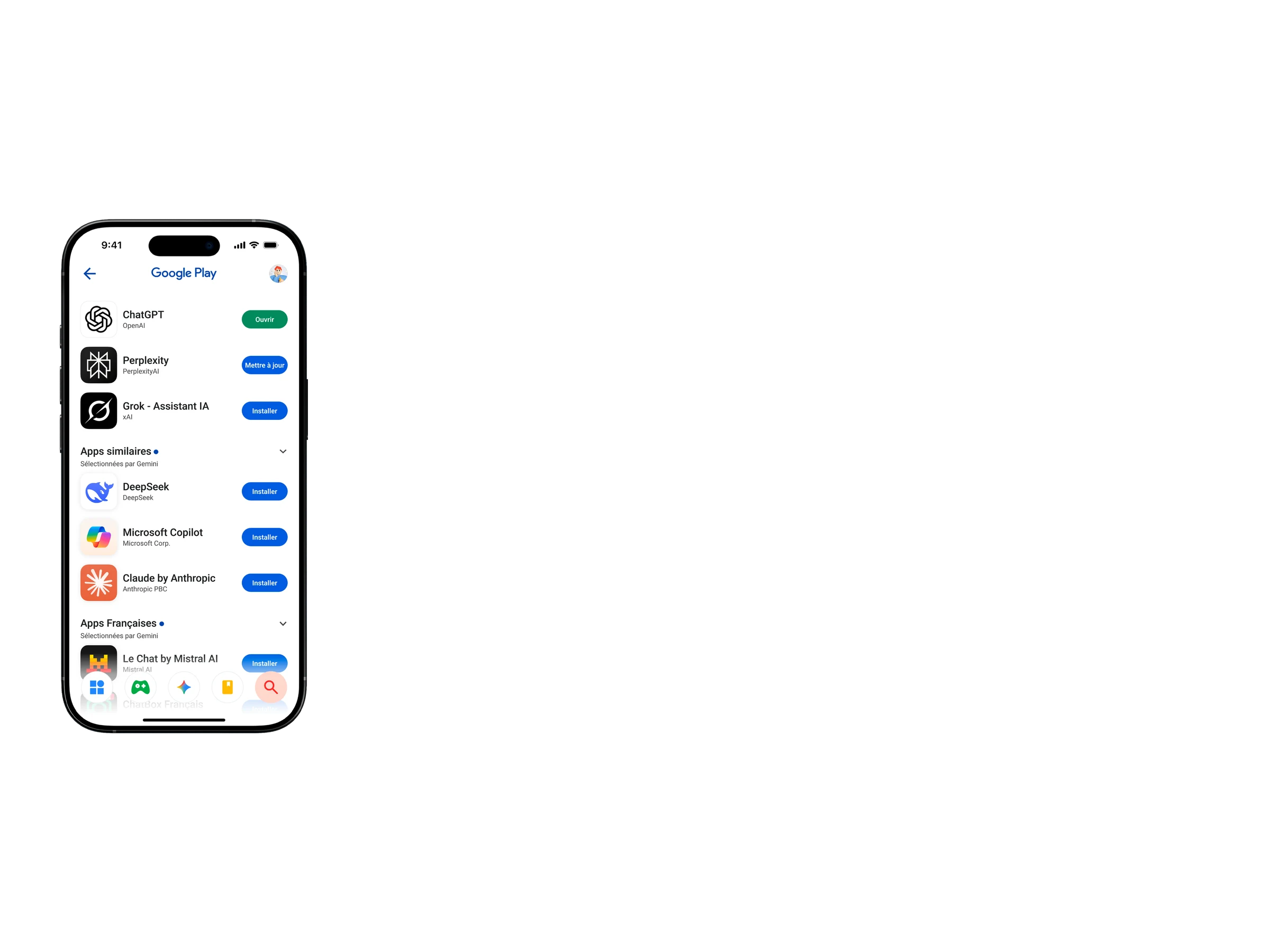
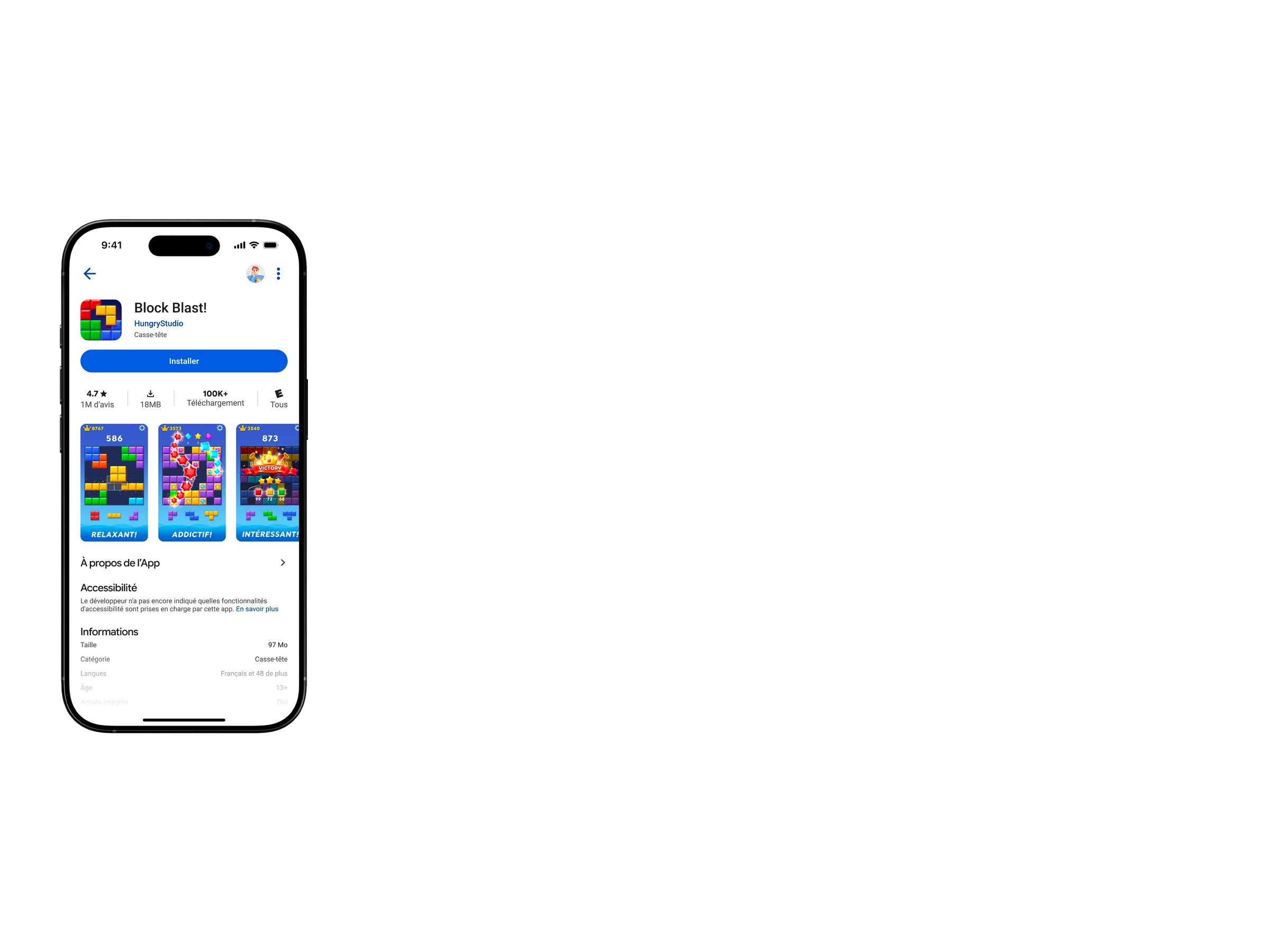
The Play Store becomes Google Play on iOS devices. The goal is to reimagine Android's iconic app so it fits seamlessly within Apple's standards, built for iPhone following the opening of alternative app marketplaces in Europe.
From green to blue
The Play Store's signature green evolves into iOS's iconic blue. Of course, those small touches of familiar green will keep the nostalgia of a now-past era alive.
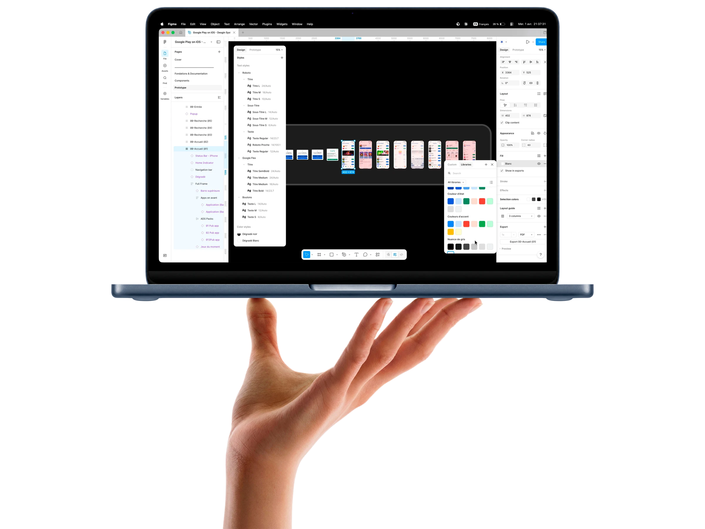
DESIGN SYSTEM PROPOSAL
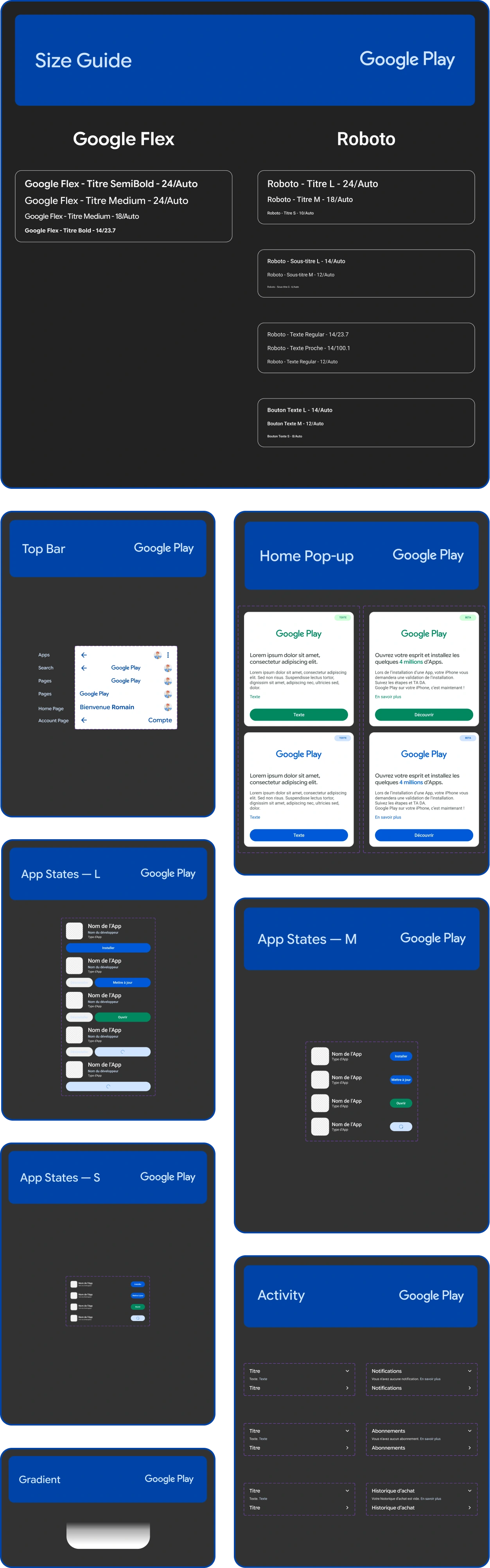
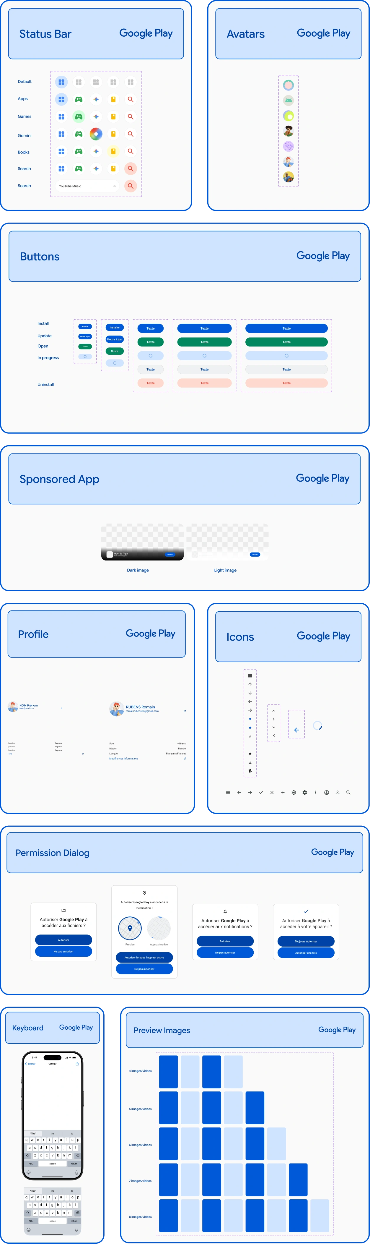
The project develops a design system imagining Google Play as a native iOS experience while preserving the identity of Google’s ecosystem. Layout structures, spacing rules, components, and typography were redesigned to align with Apple interface standards. At the same time, elements of the Play Store identity were preserved and adapted to create a credible hybrid experience between two major product cultures.
The Challenge
Building a version of Google Play on iOS following the opening of alternative marketplaces isn't just a technical port, it's a balancing act. You have to internalize the codes Apple established with the App Store: clean interfaces, controlled hierarchy, subtle micro-interactions, a sense of trust. On iOS, everything hinges on systemic coherence. Stray too far, and the experience immediately feels out of place. The challenge is fitting naturally into this environment without looking like something foreign was bolted on.
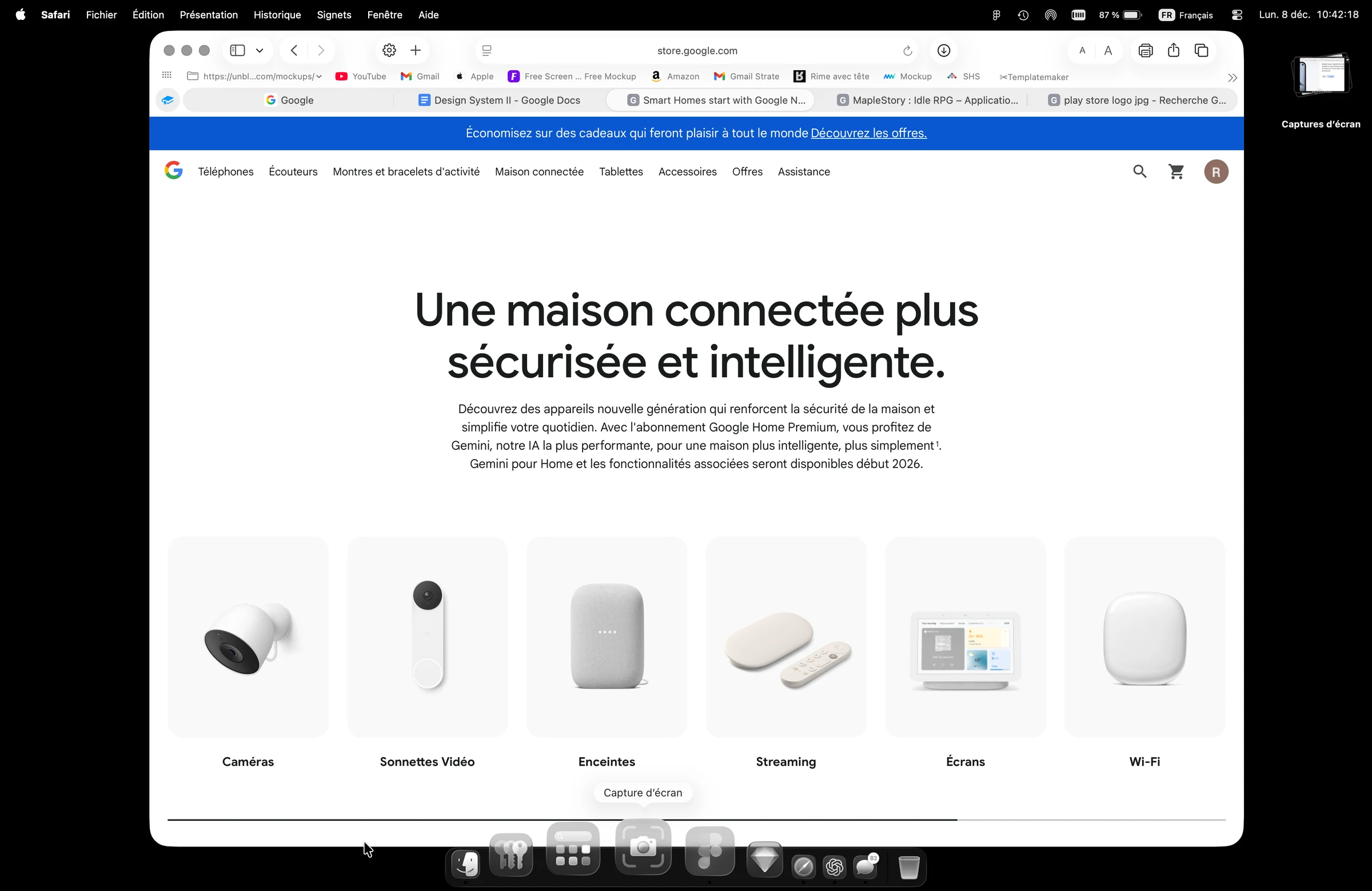
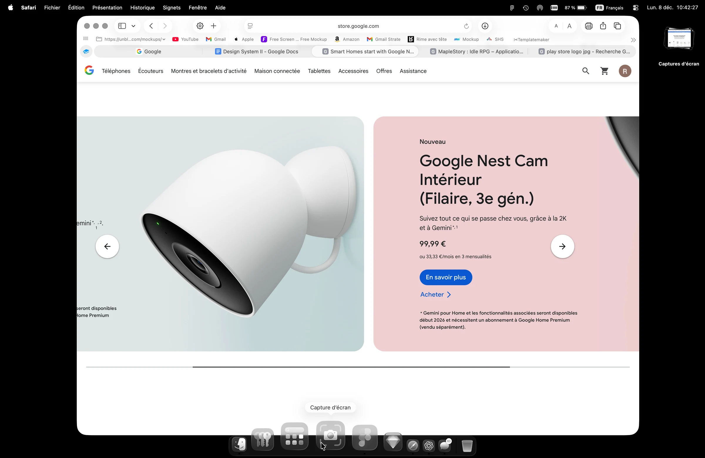
At the same time, it's essential to preserve the Play Store's DNA from Android: its dynamic recommendations, visual identity, and service-driven content logic. The Google Store adds another layer of inspiration with a more mature, modular design system. The challenge is getting these two product cultures to talk to each other without watering either one down and building something credible, hybrid, and contemporary.
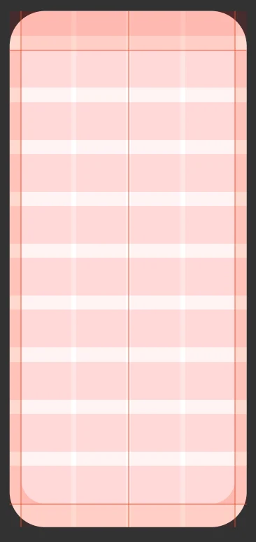
Red zone
The red zone marks the iPhone's border area. No element may be displayed there except the Status Bar and the Home Indicator.
iOS elements
The Status Bar and the Home Indicator must be present and in the foreground on every frame. No element should conflict with them
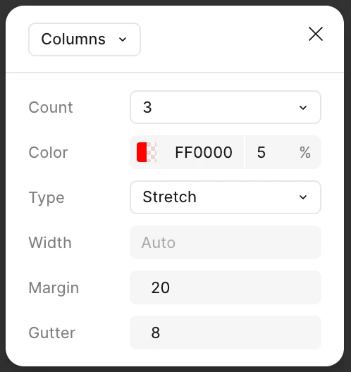
Columns
Columns (in groups of three) must be present on every frame without exception. See the rules below.
4pt spacing
All spacing must strictly follow the 4pt grid, except where elements meet the columns or the red zone those always take priority.
 Introducing