Intratone
Refonte de l'écosystème Intratone pour les particuliers.
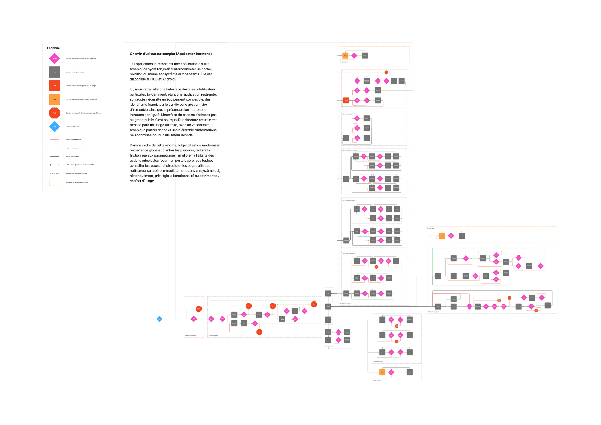
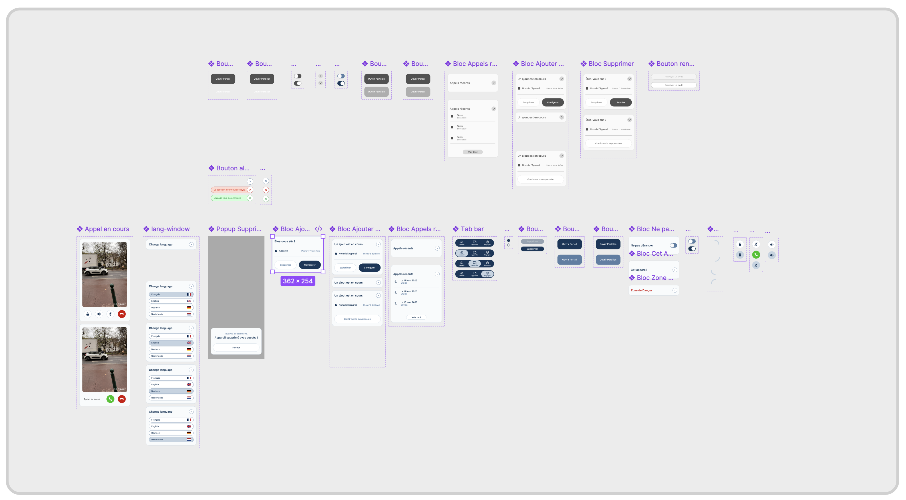
L’application Intratone est une application d’outils techniques ayant l’objectif d’interconnecter un portail/portillon du même écosystème aux habitants. Elle est disponible sur iOS et Android.
Here, we redesign the interface intended for private users. Since it is a restricted application, access requires compatible equipment, credentials provided by the property manager, and a previously configured Intratone intercom. The basic interface is not intended for the general public. This is why the current architecture is designed for utilitarian use, with dense technical vocabulary and an information hierarchy that is not optimized for an average user.
As part of this redesign, the goal is to modernize the overall experience: clarify user paths, reduce friction related to settings, improve the readability of main actions (opening a gate, managing badges, consulting access), and structure pages so that users can immediately find their way in a system that historically prioritizes functionality over user comfort.
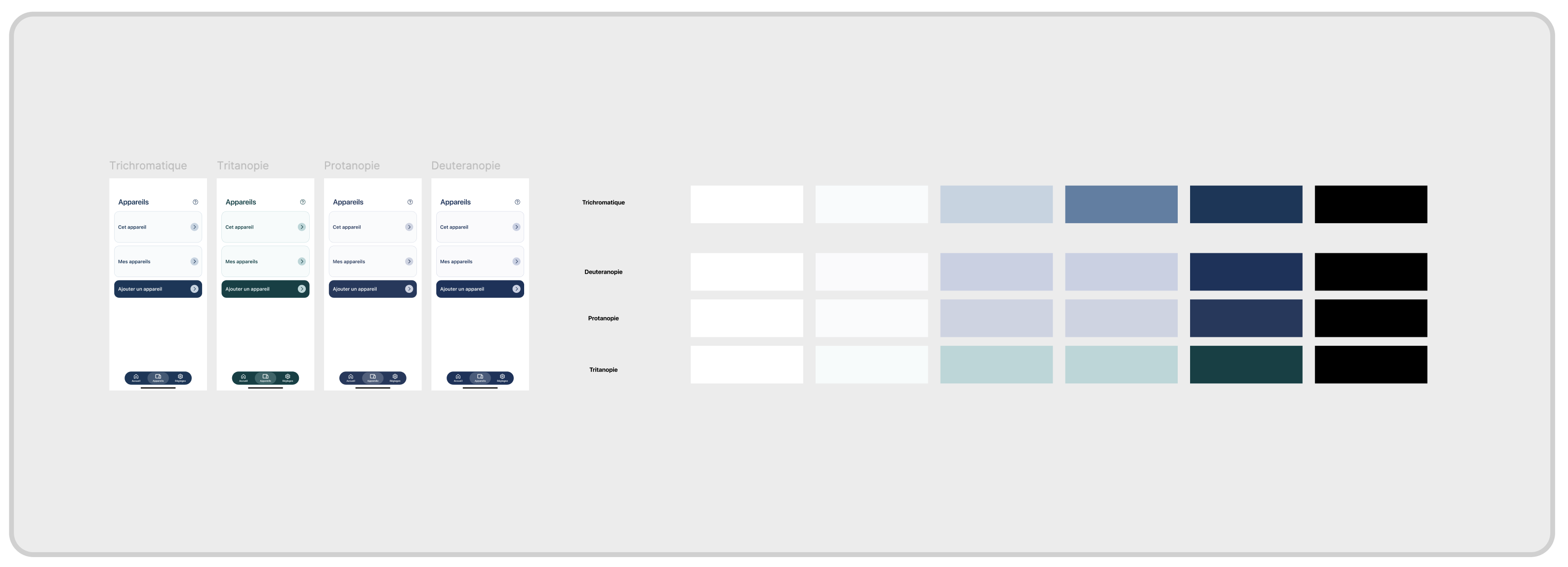
This phase of work is dedicated to selecting and validating interface colors. Palettes were tested across different types of color blindness to ensure consistent perception of hierarchies, states, and contrast. The goal isn't to create a different experience, but an equivalent, readable and undegraded experience for all users.
Comprendre comment le produit fonctionne, pas seulement à quoi il ressemble.
Accéder au fichier FigmaVoir le prototype Figma